Daje — an online store that specializes in beautiful designer items for everyday life
eCommerce
/
Retail
/
Europe
Daje is an online store that specializes in beautiful designer items for everyday life. It offers a wide range of interior objects for the home, including tableware, candles, textiles, as well as clothing, cosmetics, jewelry, and gifts sourced from local producers. We have re-designed the online store and refined the branding to enhance the overall shopping experience.
Project scope
Design Audit
Prototyping
Art Direction
Concepts creation
UI/UX Design
Intro
We have decided to redesign the user interface for the online household goods store, Daje. Our goal was to create a more organized and visually pleasing design that combines a sense of home comfort with elements of minimalism and aesthetic appeal.

Art direction
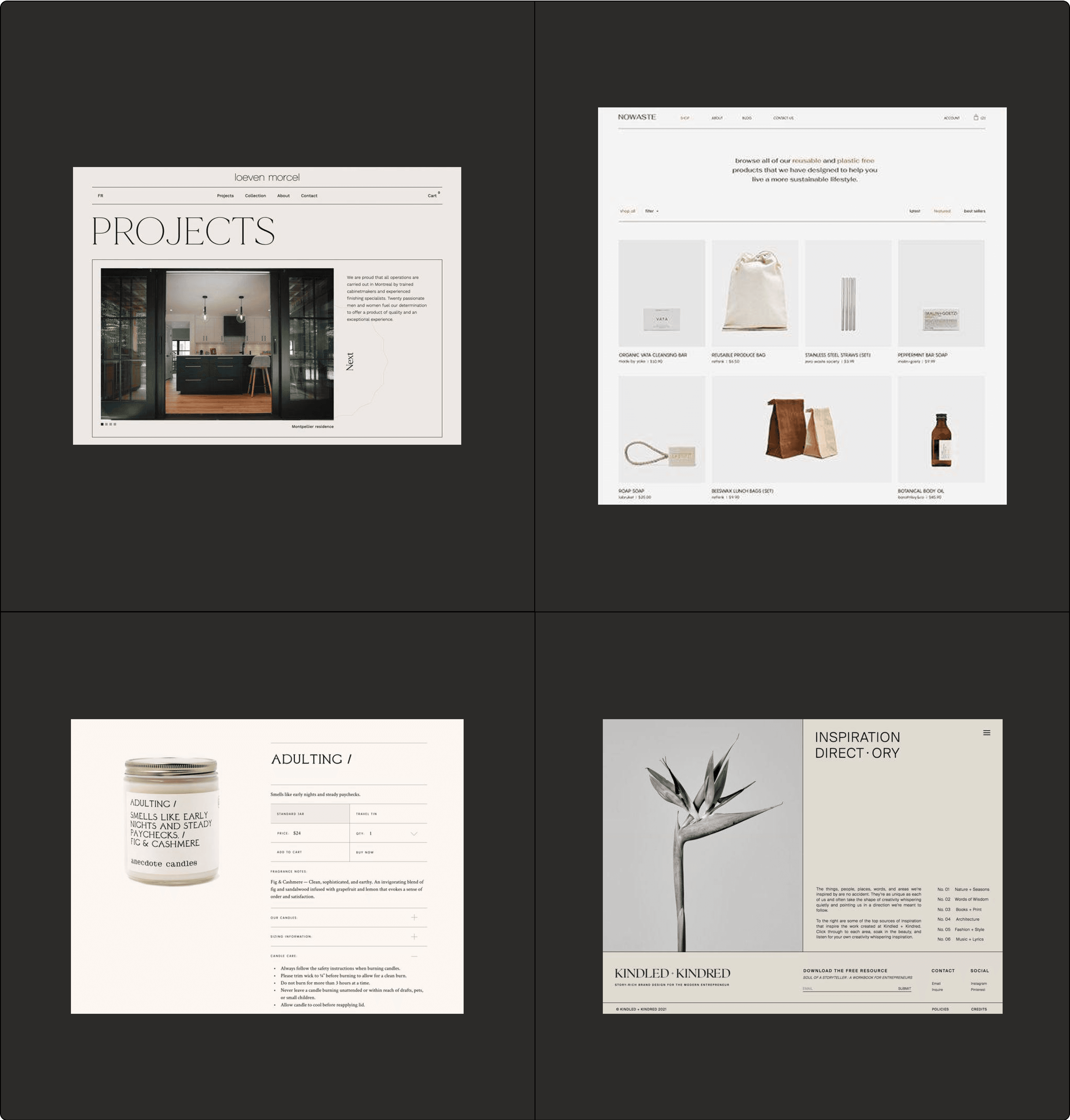
The central concept revolved around maintaining organization, akin to a tidy bathroom, while simultaneously presenting items in a light and minimalistic manner. Additionally, our aim was to convey a sense that the items are meticulously crafted. Here are some references that reflect this idea.
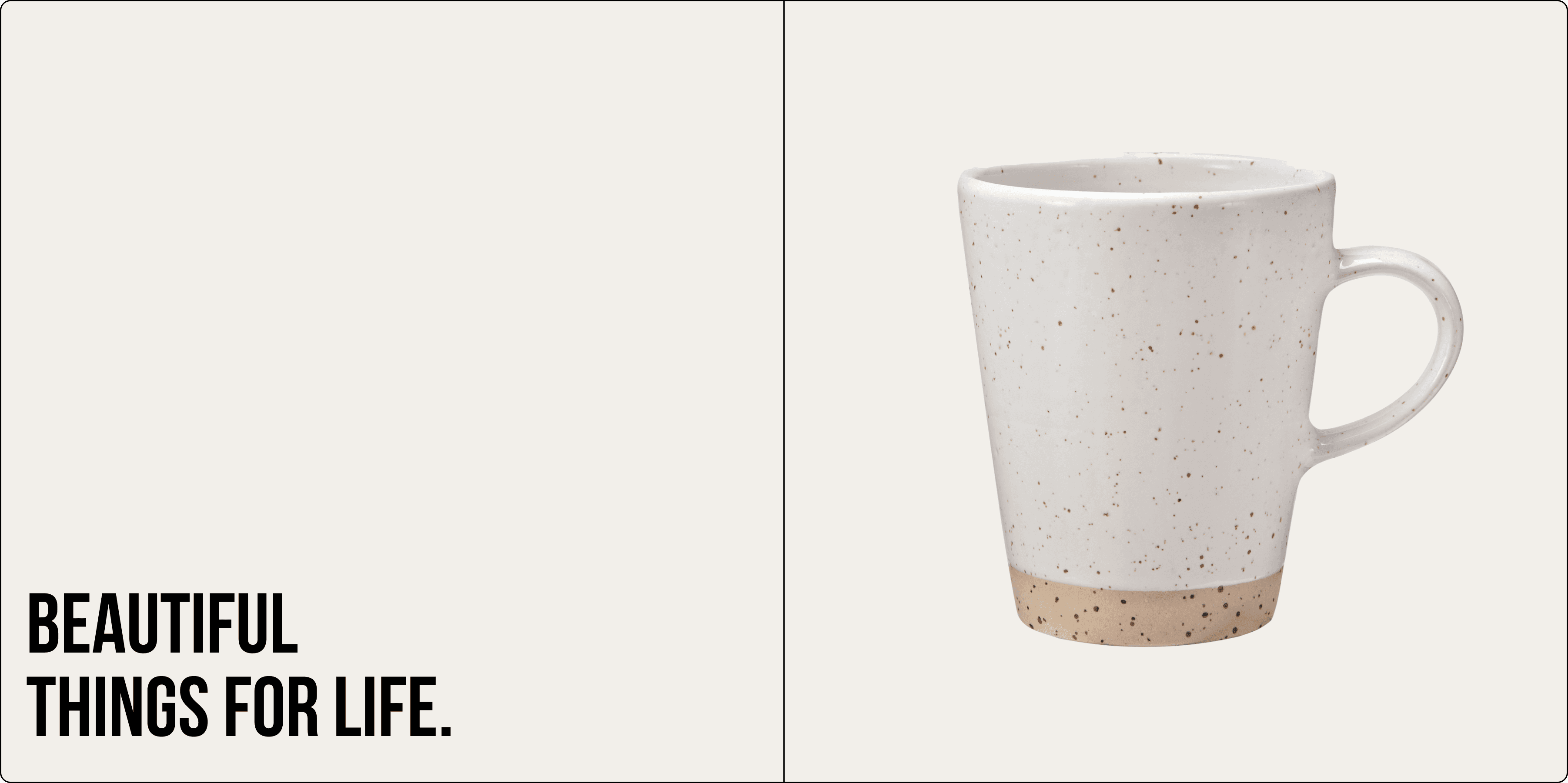
However, we desired the typography to exude an urbanistic vibe, considering that our target clients primarily reside in bustling metropolises. To achieve this, we opted for Bebas Neue, an urbanistic monospaced font characterized by its brutal yet minimalistic grotesque style.
User interface
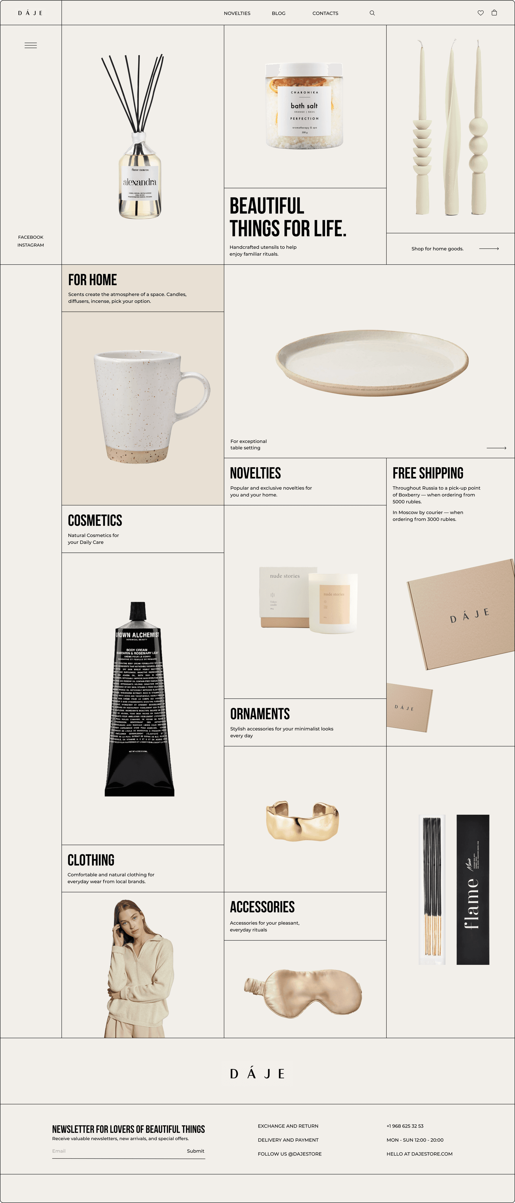
We developed a minimalistic and organized interface by dividing the layout into rectangles that align with a grid. Contrast straight lines were utilized to highlight a sense of well-organized storage. Simultaneously, we incorporated ample white space to create a feeling of cleanliness and minimalism. To evoke a sense of comfort, we opted for an ivory background color.
Homepage
The homepage displays product categories to facilitate navigation speed.
Category page
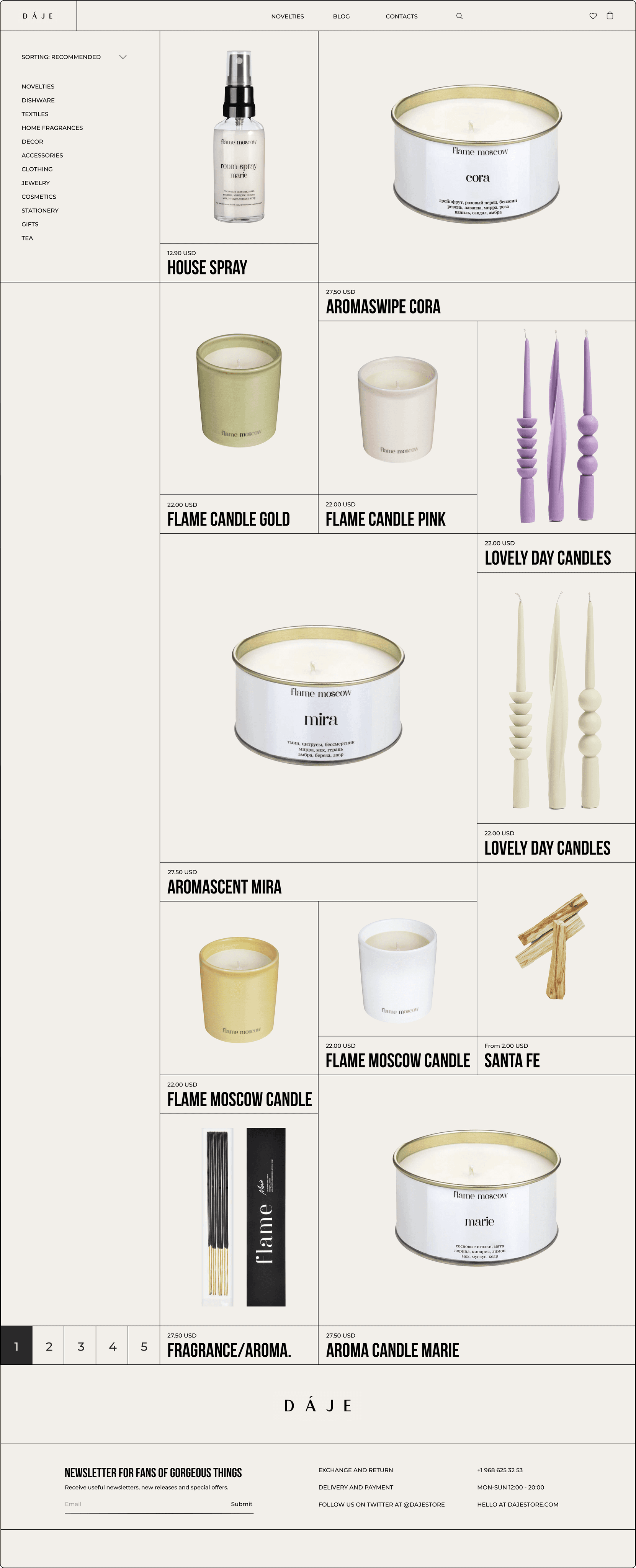
All cards are designed with a minimalist approach, and a simple filtering and sorting option is affixed to the top-left corner.
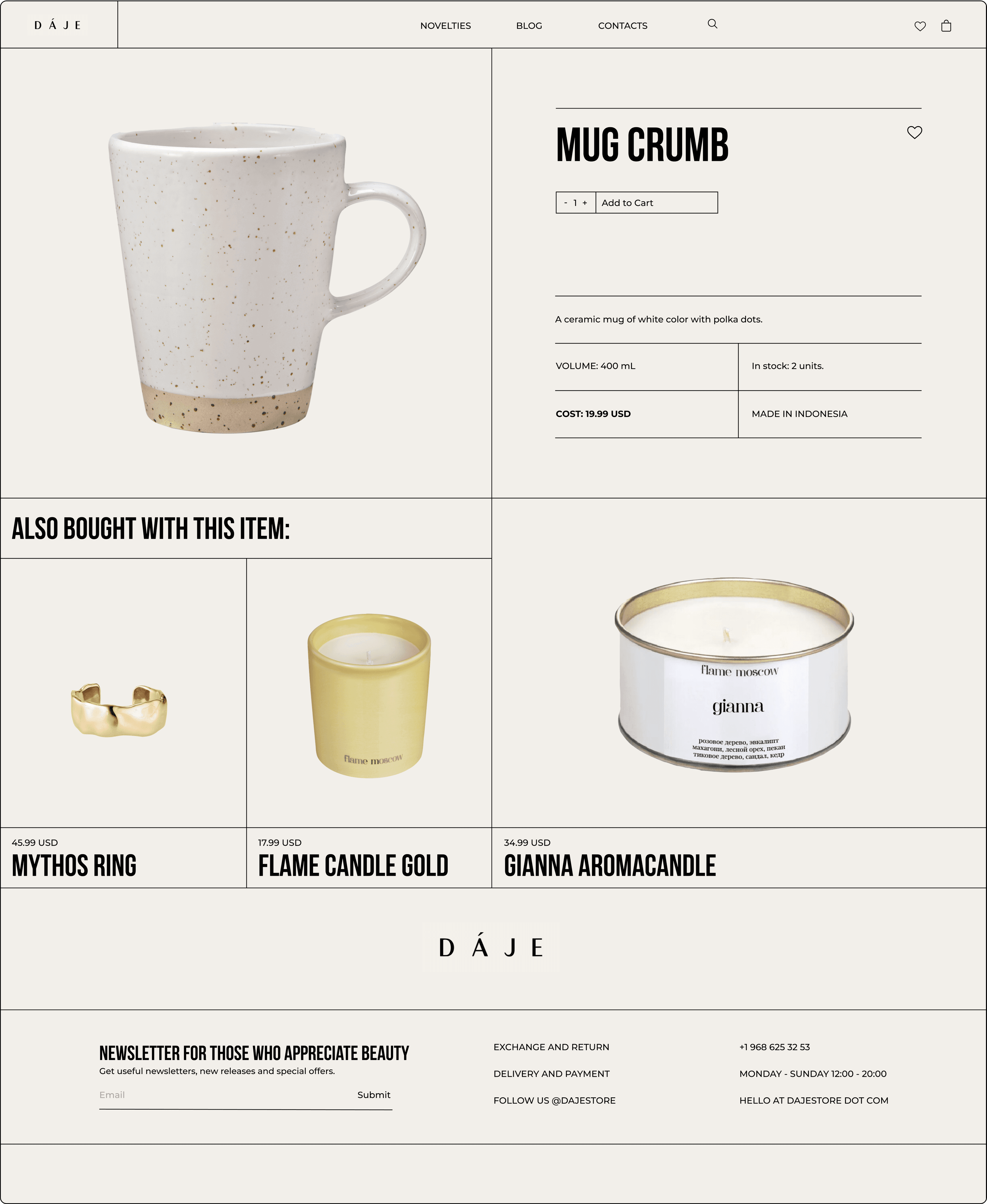
Product page
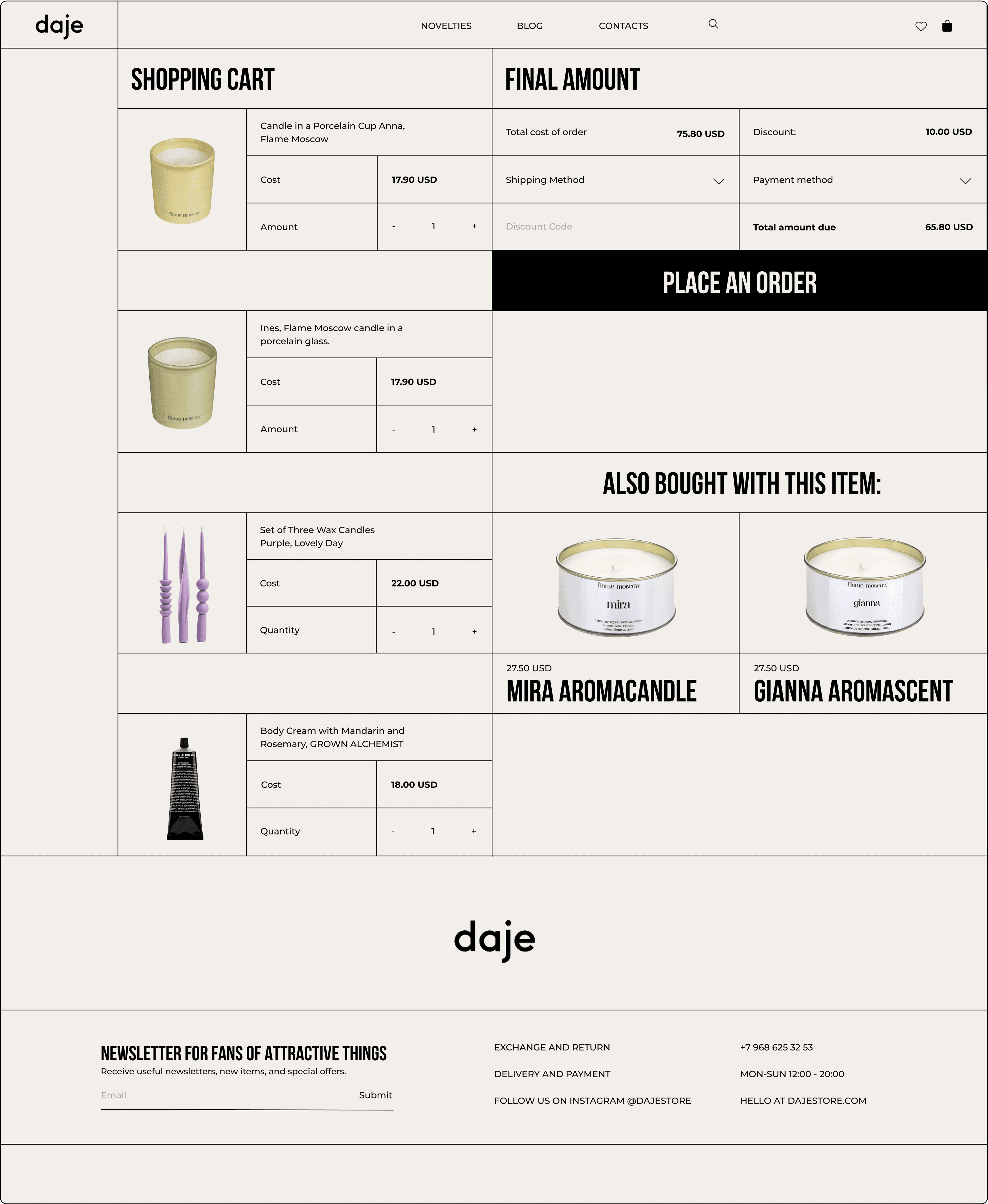
Cart
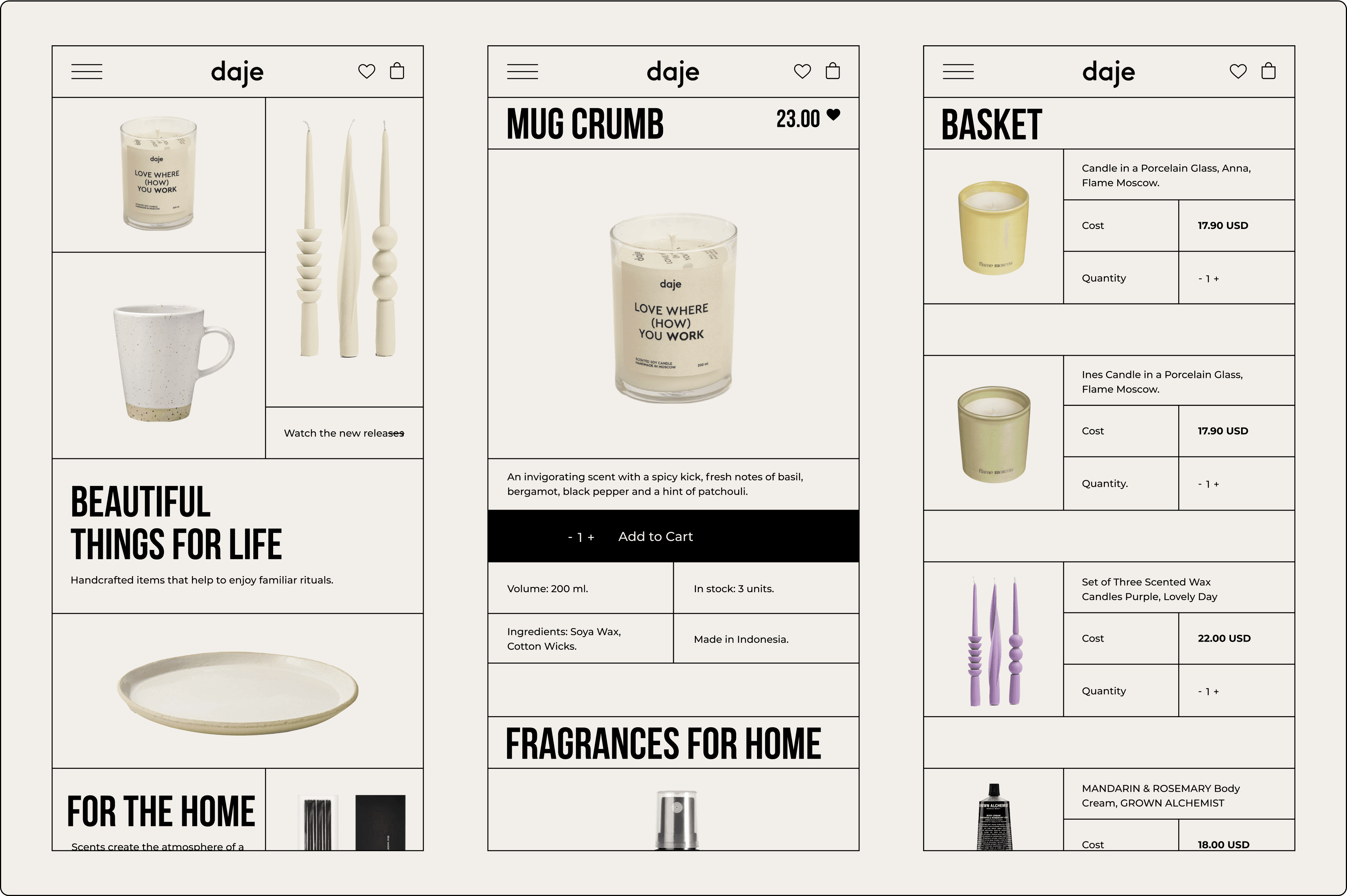
Responsiveness
Credentials
Art direction, UI/UX Supervision: Dmitry Chernov, UI/UX Design: Elizabeth Saveleva
