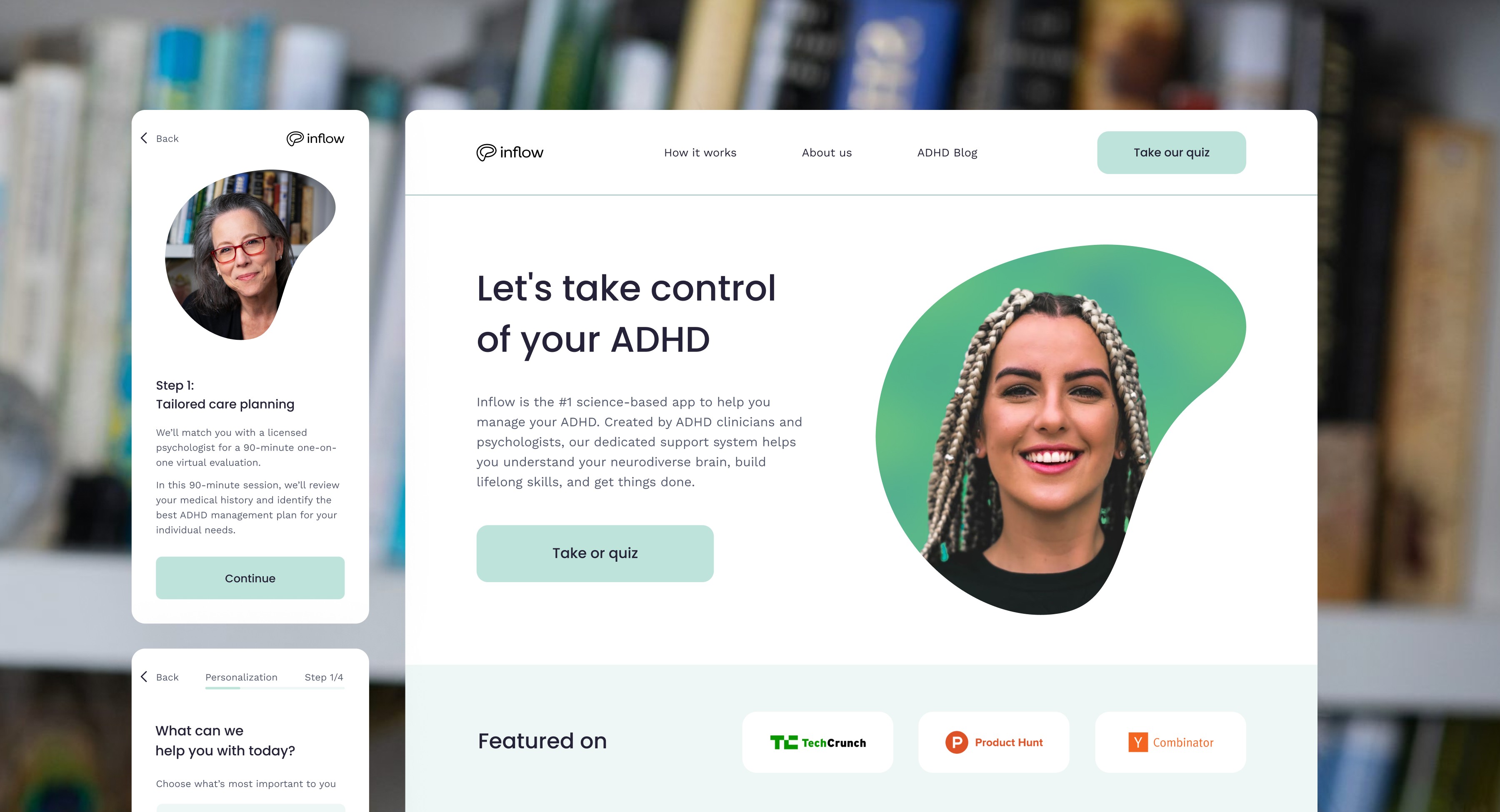
Inflow App website and digital assets redesign
UI Redesign
/
Healthcare
/
UK
Inflow is the number one science-based app designed to assist individuals with ADHD. Inflow required the design of various digital assets to support the marketing of the Inflow app, including the Inflow website redesign, onboarding flows, questionnaires, landing pages, social media ads, and presentations.
Project scope
Design audit
Onboarding flows UI/UX design
Landing pages design & dev
Website re-design and dev
Social media ads creation
Presentations design
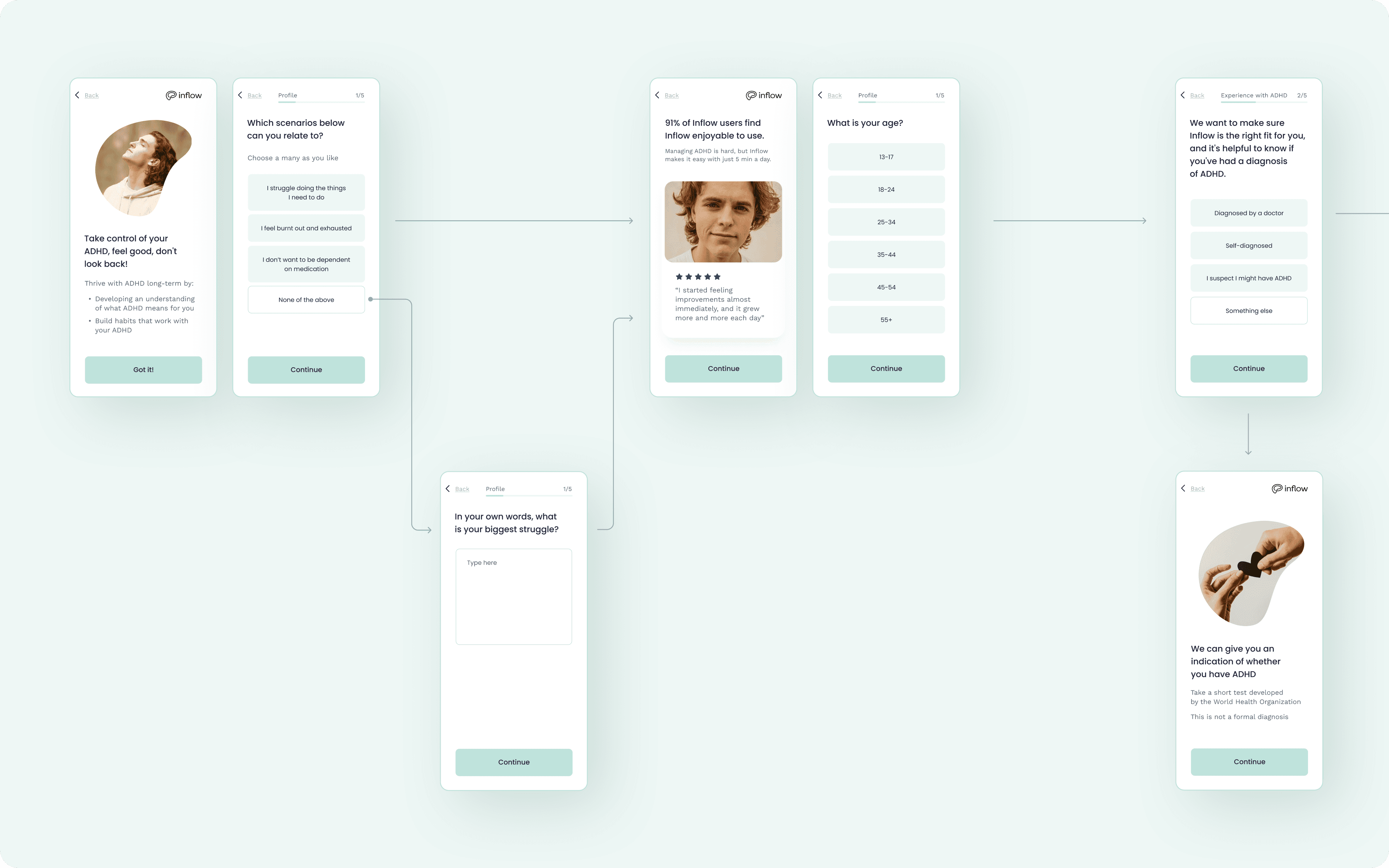
User onboarding flow
The first task was to redesign the UI for the existing client onboarding quiz. I conducted a design audit, optimized the UX flow, and refreshed the UI by resolving layout, typography, and graphics issues, as well as making the UI components more visually appealing and neat. At this step I started a design system with typography and color foundations and minor components set that includes buttons, text fields, selectors, and checkboxes.
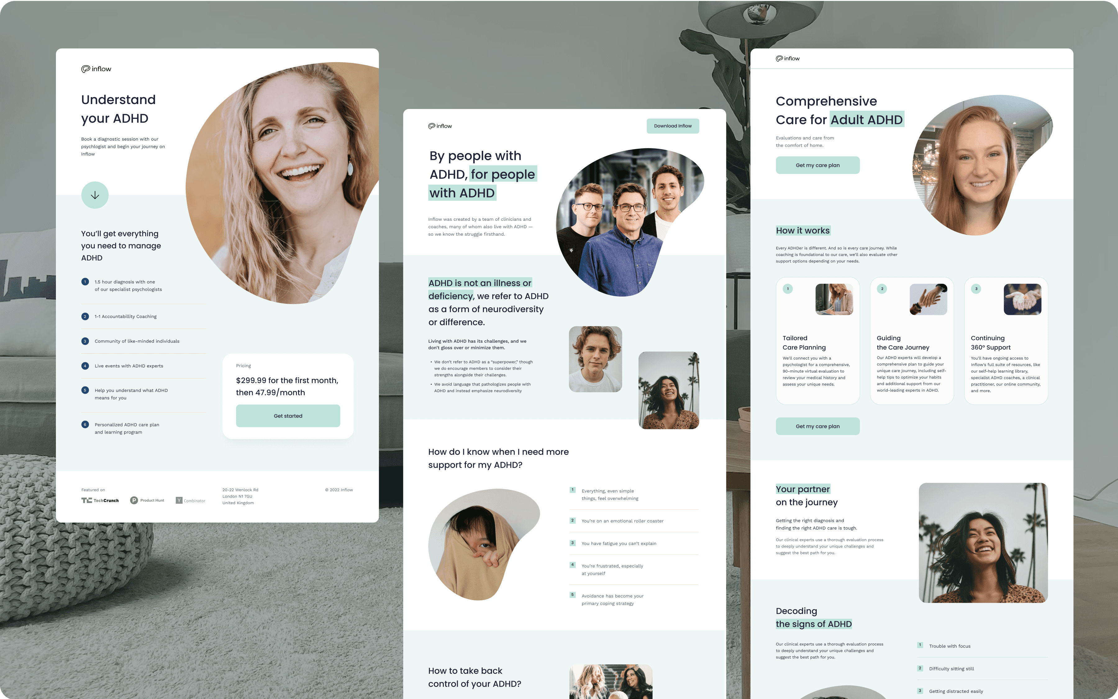
Landing pages
For this project I designed multiple landing pages for different products to test within different onboarding flows. Landing pages were designed in Figma in a single consistent visual style, and then implemented on Unbounce.
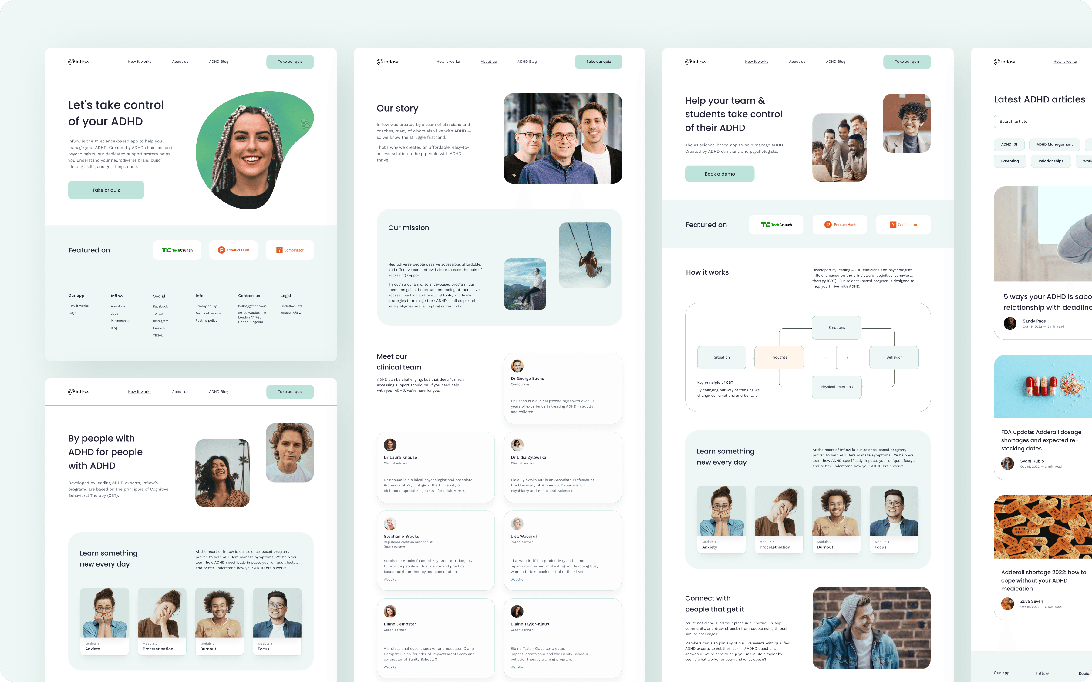
Inflow app website refinement
The client also tasked me with refining the existing app website. I addressed all layout, typography, color, and graphic issues, and created responsive mockups for all website pages, including the homepage, how it works, about us, partnerships, FAQ, blog, and articles. During the process of designing the mockups, I expanded the design system with new components. Subsequently, I refined the website design on Webflow, implementing the Client-first convention to facilitate easy management of the website's CSS. Additionally, I provided instructions to the content manager.
Social media ads design
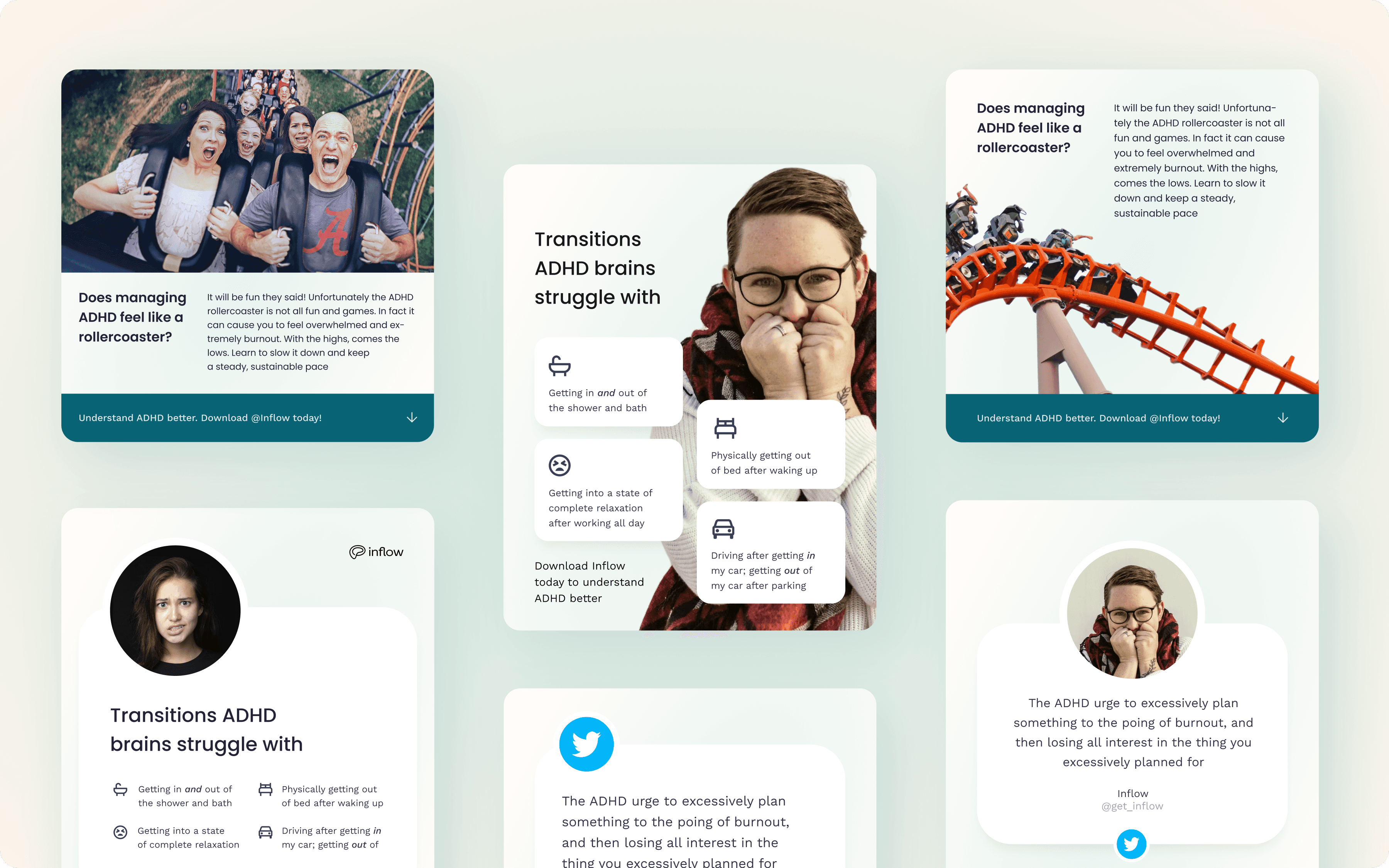
Based on a new refreshed visual style, we created new social media ads in collaboration with marketing department. I created over 50 different visual ideas for ads and we selected he best ones for A/B tests.
Onboarding webinar presentation
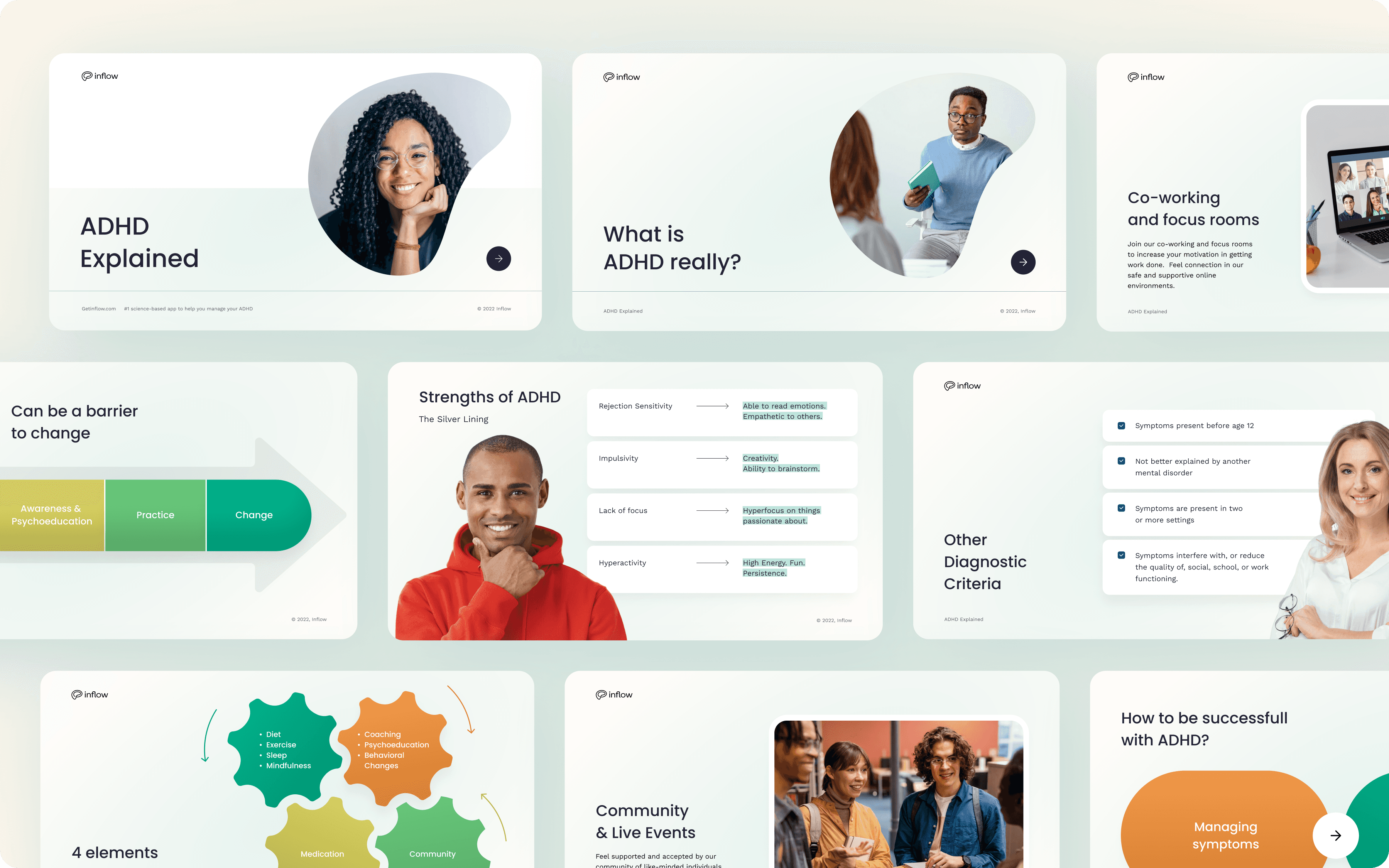
The client requested to redesign the existing onboarding webinar presentation. We worked closely with an Inflow psychotherapist to fine-tune the presentation content. Following that, I designed the entire deck in Figma, adopting a new visual style that aligns with the main website's aesthetics. Additionally, I simplified the slides to make the content more concise and user-friendly.
Credentials
Art direction, UI/UX Design: Dmitry Chernov
