Peter Lindbergh Biography long read
Editorial
/
Phootography
/
Germany
Peter Lindbergh was a renowned German fashion photographer and film director acclaimed for his captivating black and white images and unique, naturalistic style. We crafted a comprehensive biography that delves into the significant milestones and notable works of this iconic photographer. Our role encompassed copywriting, defining the art direction, and developing a memorable user interface.
Project scope
Copywriting
Art direction
Concepts creation
Visual design
Intro
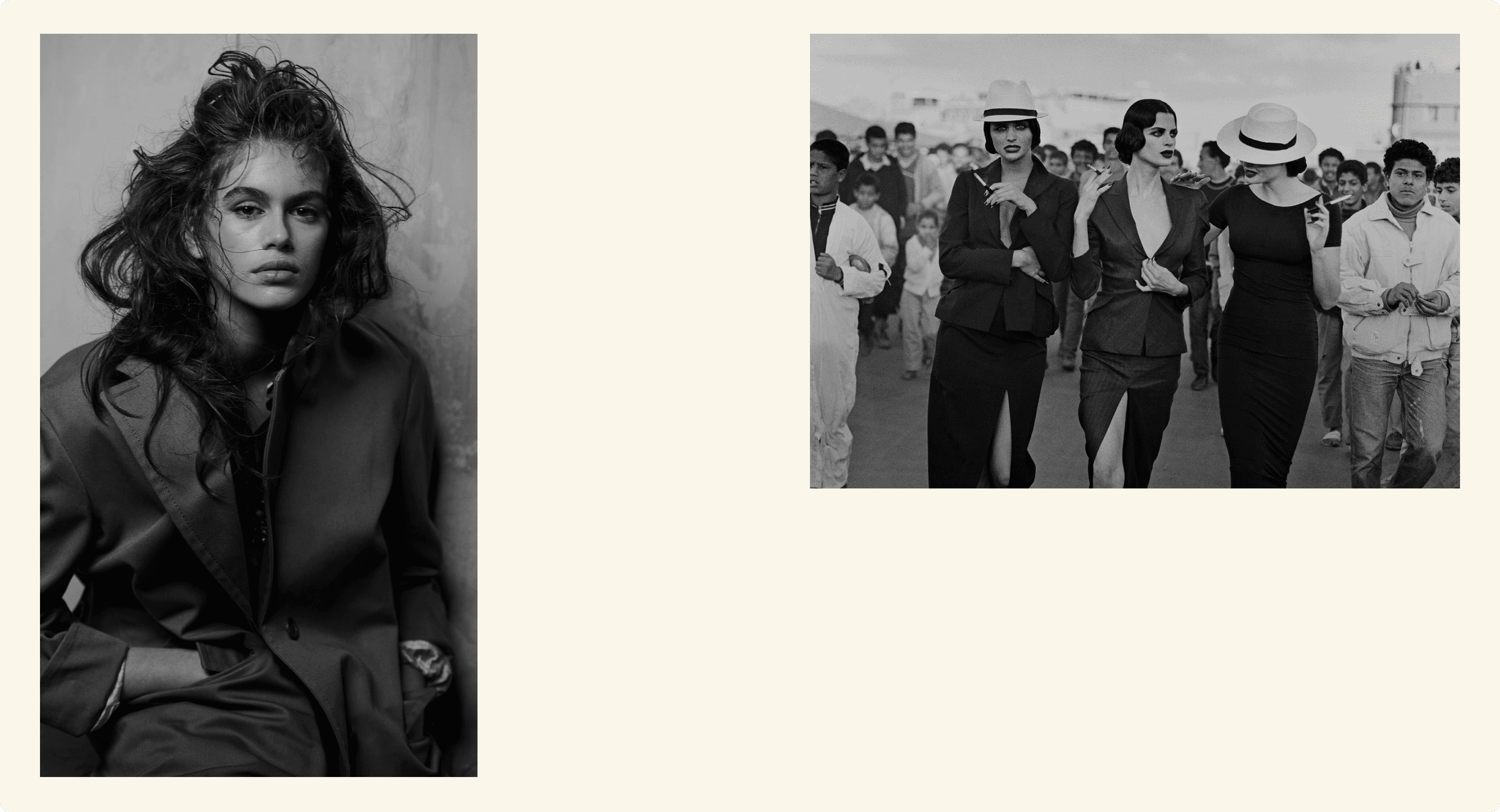
We designed a website about the professional German fashion photographer Peter Lindbergh, whose photographs aimed to convey intellect, individuality, boldness, and a sense of humor. He revolutionized the fashion industry by defending a woman's right to be herself in front of his camera lens. The main goal was to free women from imposed beauty standards. He fought against photo retouching and often made black and white photographs, as he believed that color distracts from the face.
Art direction
It was important to convey the emotions reflected in the photographer's work. It's about freedom, openness, courage, acceptance, love, strength, and beauty. Introducing the author and presenting their body of work, their approach to creativity, and their character; creating and conveying the desired mood that evokes delight and interest.
Here are the key meanings that were important to convey:
Independence — The photographer himself chose the shooting style, location, and most importantly, the models.
Freedom — The main goal was to free women from imposed beauty standards.
Naturalness — Peter fought against photo retouching and firmly advocated for a woman's right to be imperfect, to have wrinkles, and still be beautiful.
Focus on content — The photographer made black and white photographs because he believed that color distracts from the face.
Imagery
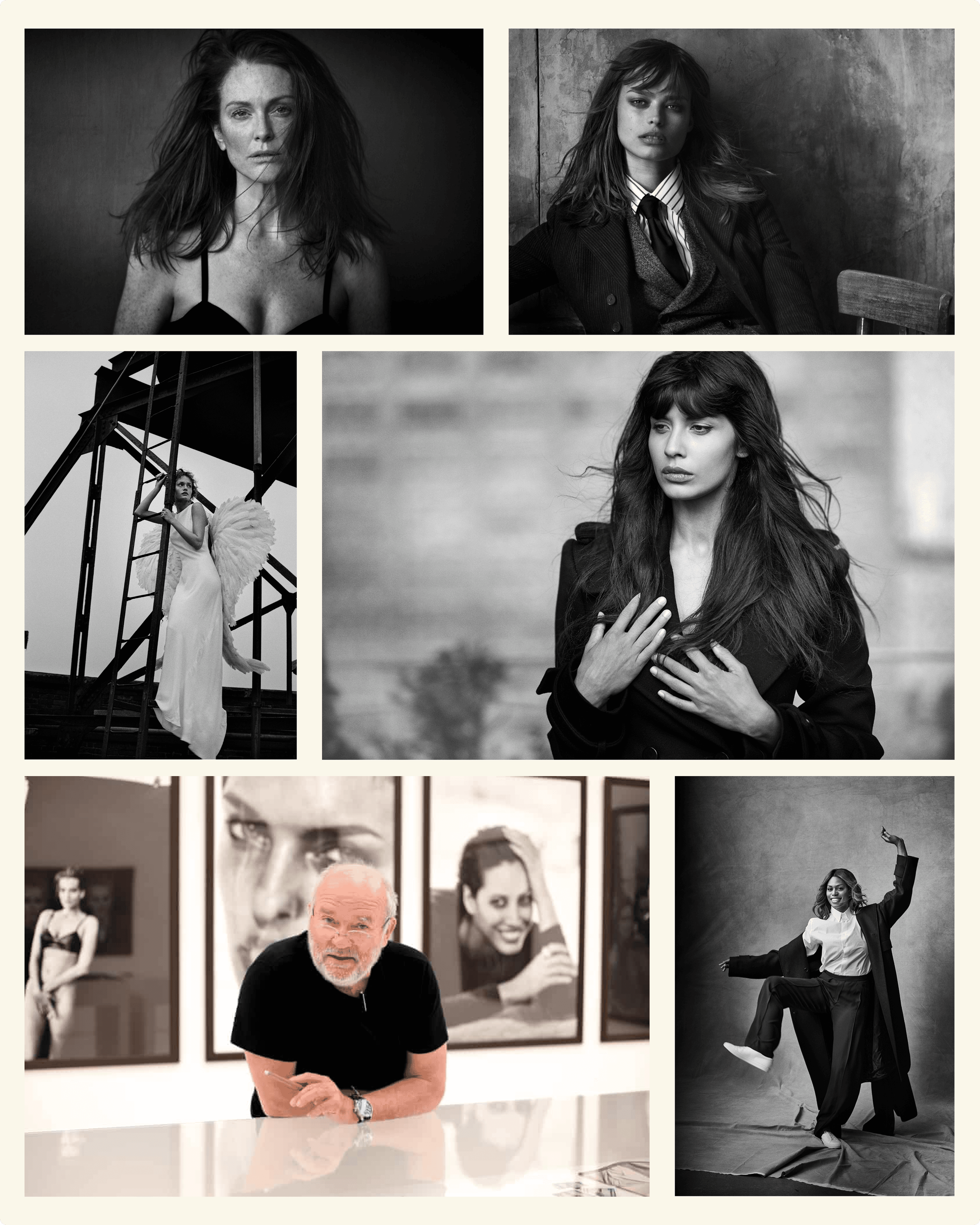
It was important to convey the character and style of the works, to evoke delight, interest, and capture attention. To convey independence, strength, and creativity through imagery. Emphasize the author's individuality, courage, and creativity. Dark silhouettes against a light background or bright details on a black background captivate and evoke feelings and emotions that colors wouldn't awaken. A black and white frame leaves room for imagination, and imagination is better than thousands of shades, making the photograph come alive.
Color
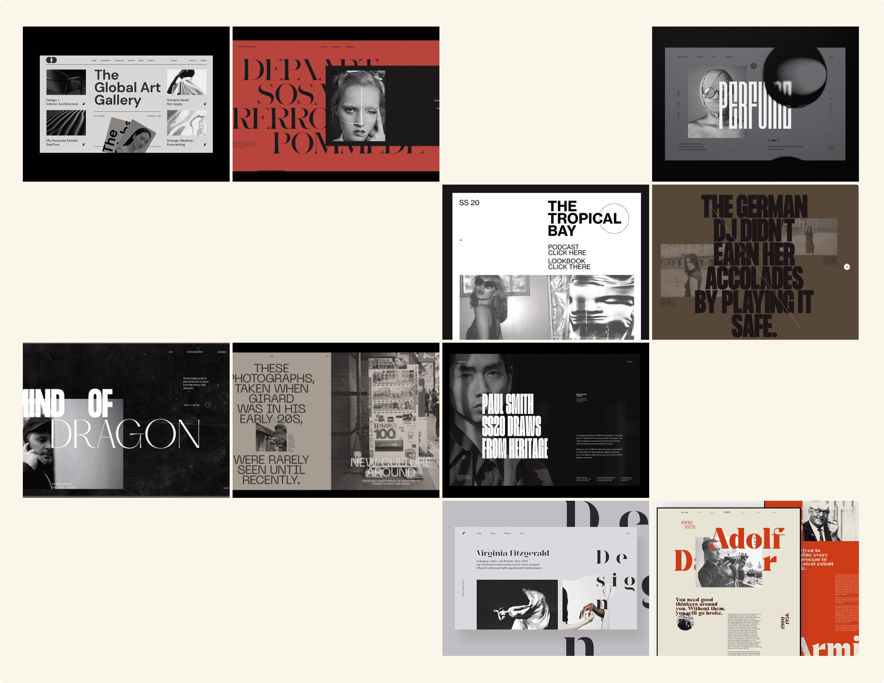
We considered using black and white or sepia as the main tones to shift the focus of attention onto the works themselves. We aimed to utilize strong color contrasts to draw attention to the headlines. Additionally, we wanted to use red as an accent to convey independence and firmness in expressing the author's viewpoint.
Composition
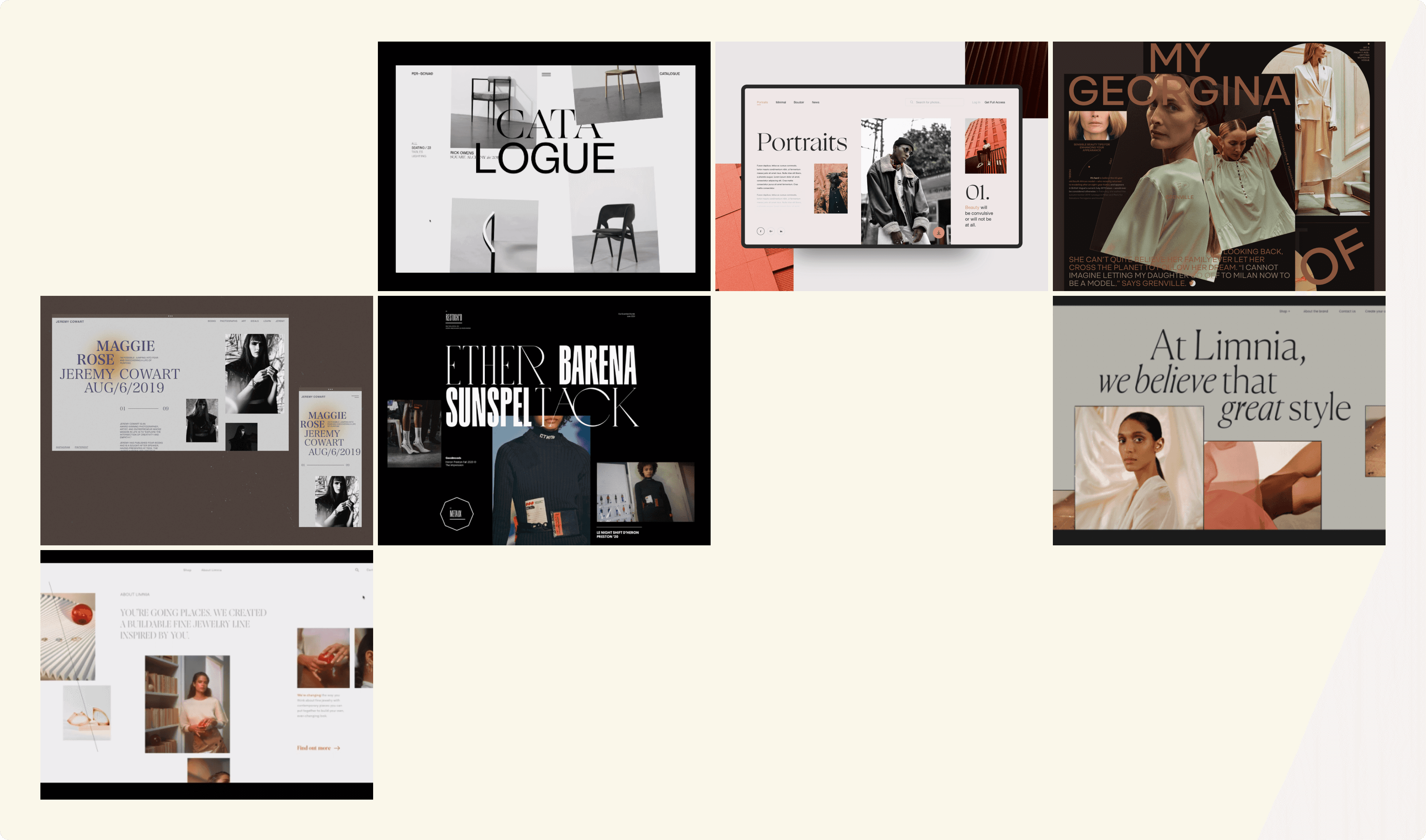
To convey a sense of freedom and self-expression, we aimed to utilize chaotic compositions with abundant negative space.
Typography
We considered using elegant, humanistic fonts in a large size for headings to convey a blend of warmth, beauty, and strength.
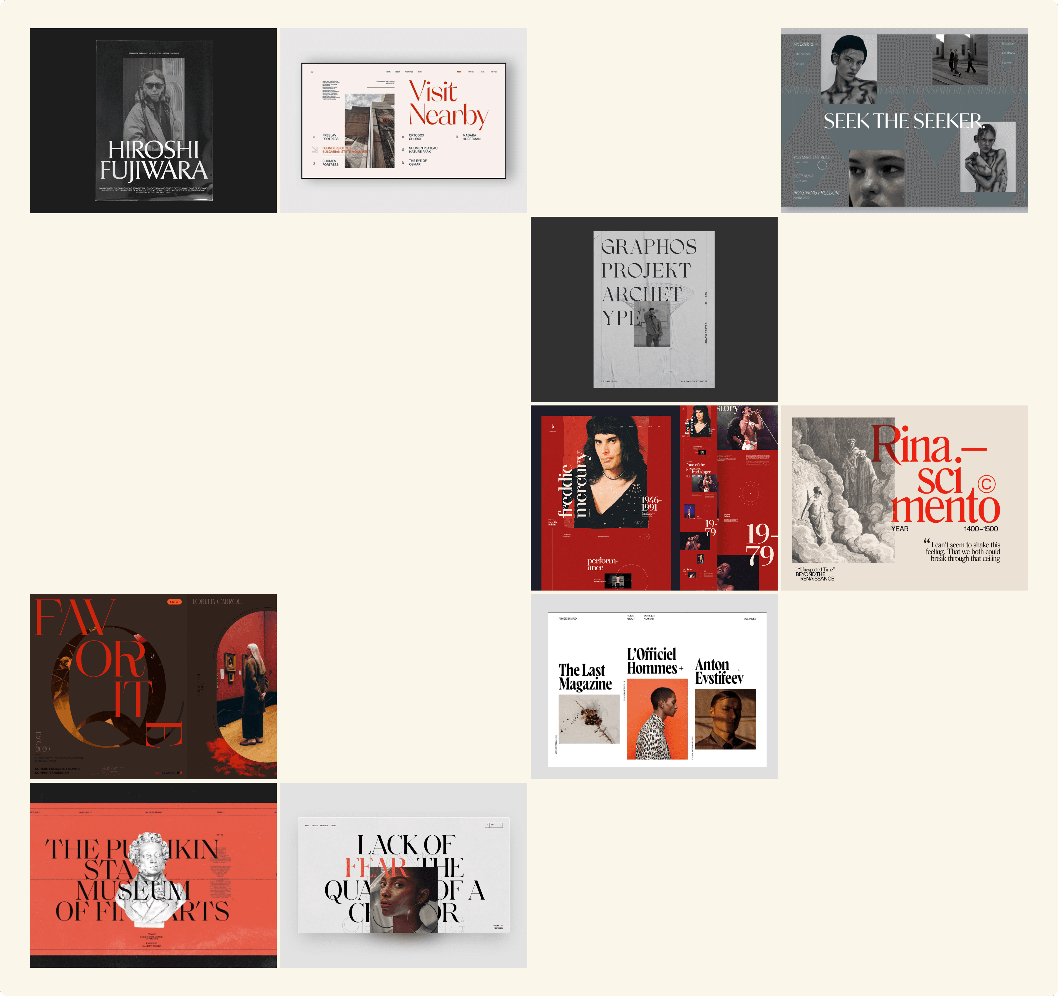
Explorations
Here are some composition and typography explorations that reflect the meanings gathered during the previous design stages. It appeared that we were close, but something was missing.
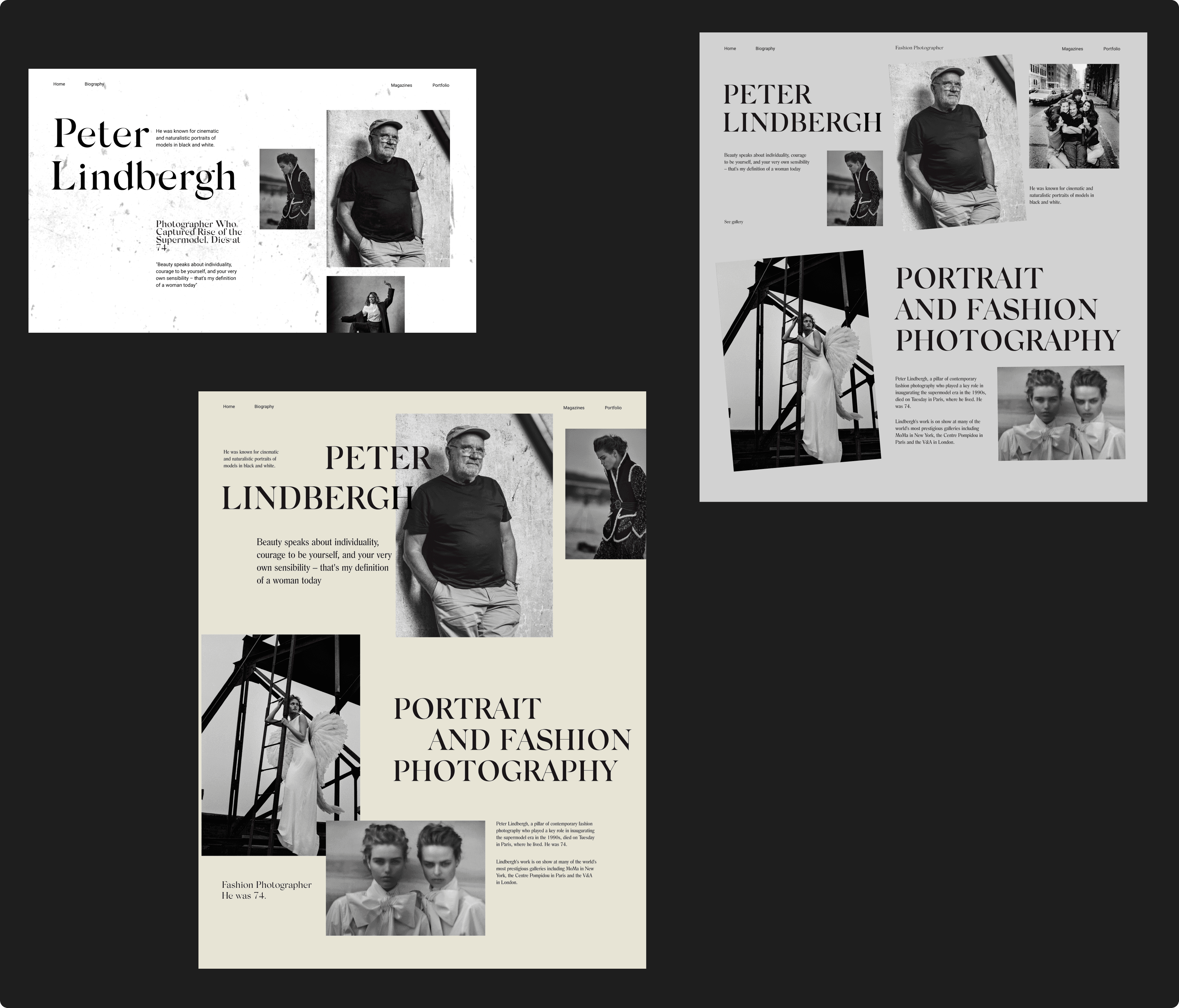
Final design
After several iterations we came out with the final design mockup. We added red accents and decided to keep ivory background for warmth.

Credentials
Art direction, Design supervision: Dmitry Chernov, Visual Design: Julia Lisitsyna
