English learning app design
App design
/
EdTech
/
Global
Puzzle English is an online platform for self-study of English. It focuses on developing listening, reading, writing, and speaking skills. The task was to design an app from scratch.
Project scope
UX Research
User flows
Prototyping
Art direction
Concepts creation
UI design
Intro & Research
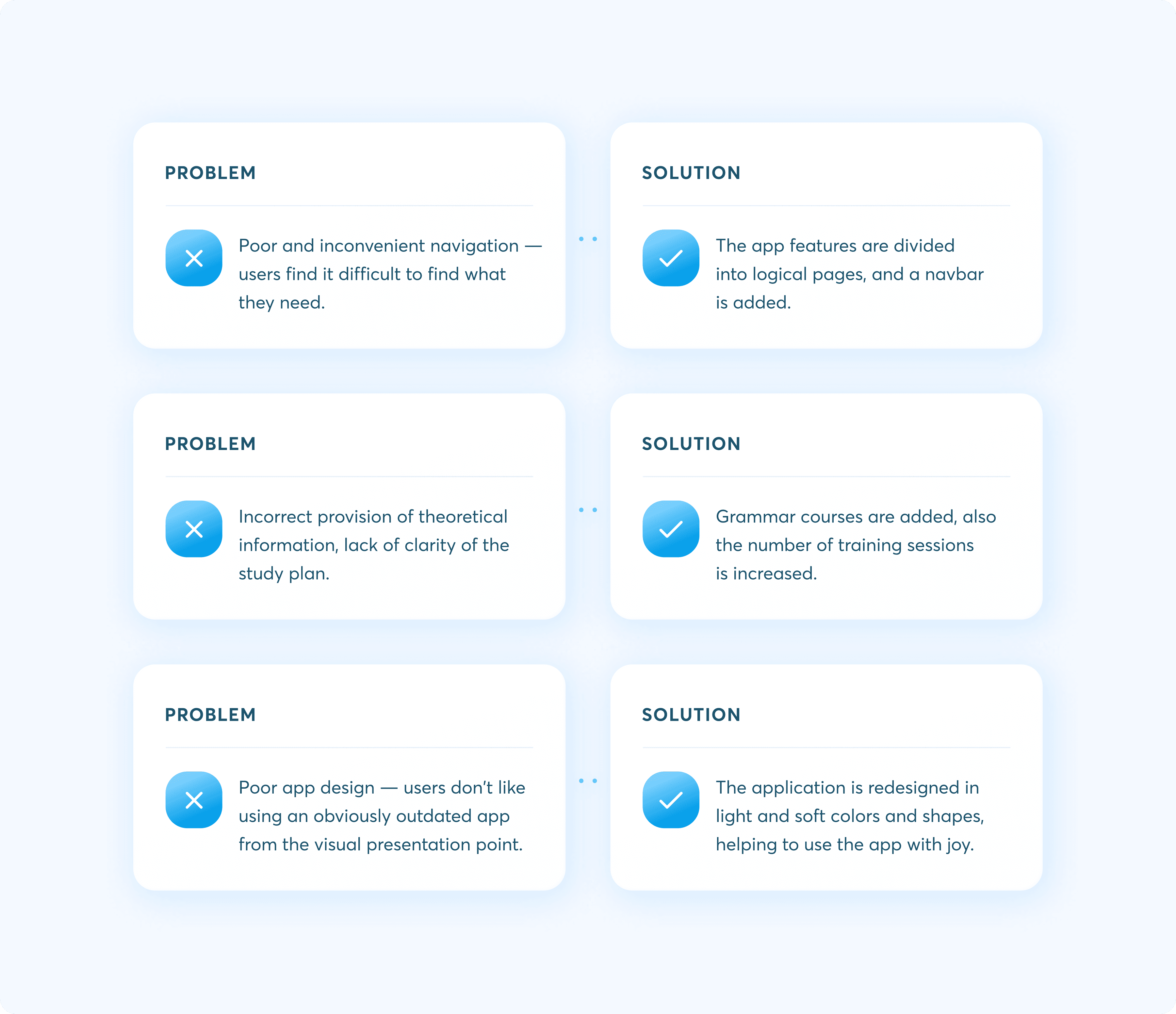
We have made the decision to redesign the original Puzzle English app due to its outdated interface and UX issues, which have occasionally caused inconvenience for users. Before proceeding, we conducted an audit of the existing app and performed competitor benchmarking to gather insights on the most engaging user scenarios. Additionally, we audited existing user reviews and collected key points for improvement. This comprehensive analysis has aided us in developing the most engaging user scenarios for the app.
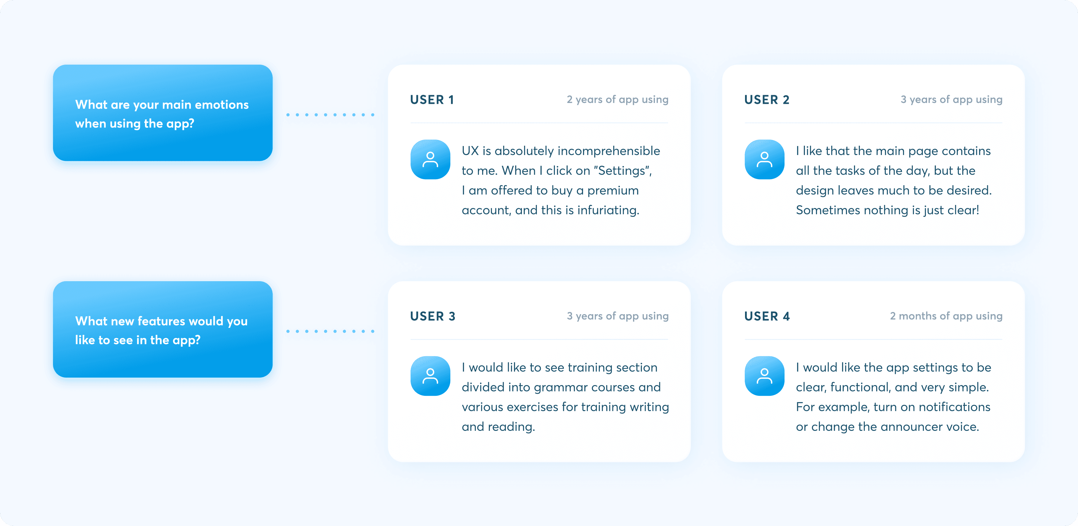
User scenarios & Learning path
Based on user responses, we have created a user flow map to enhance the convenience and functionality of the app. This map also assists us in understanding which features should be prioritized. This process has been instrumental in visualizing and prototyping the app screens.
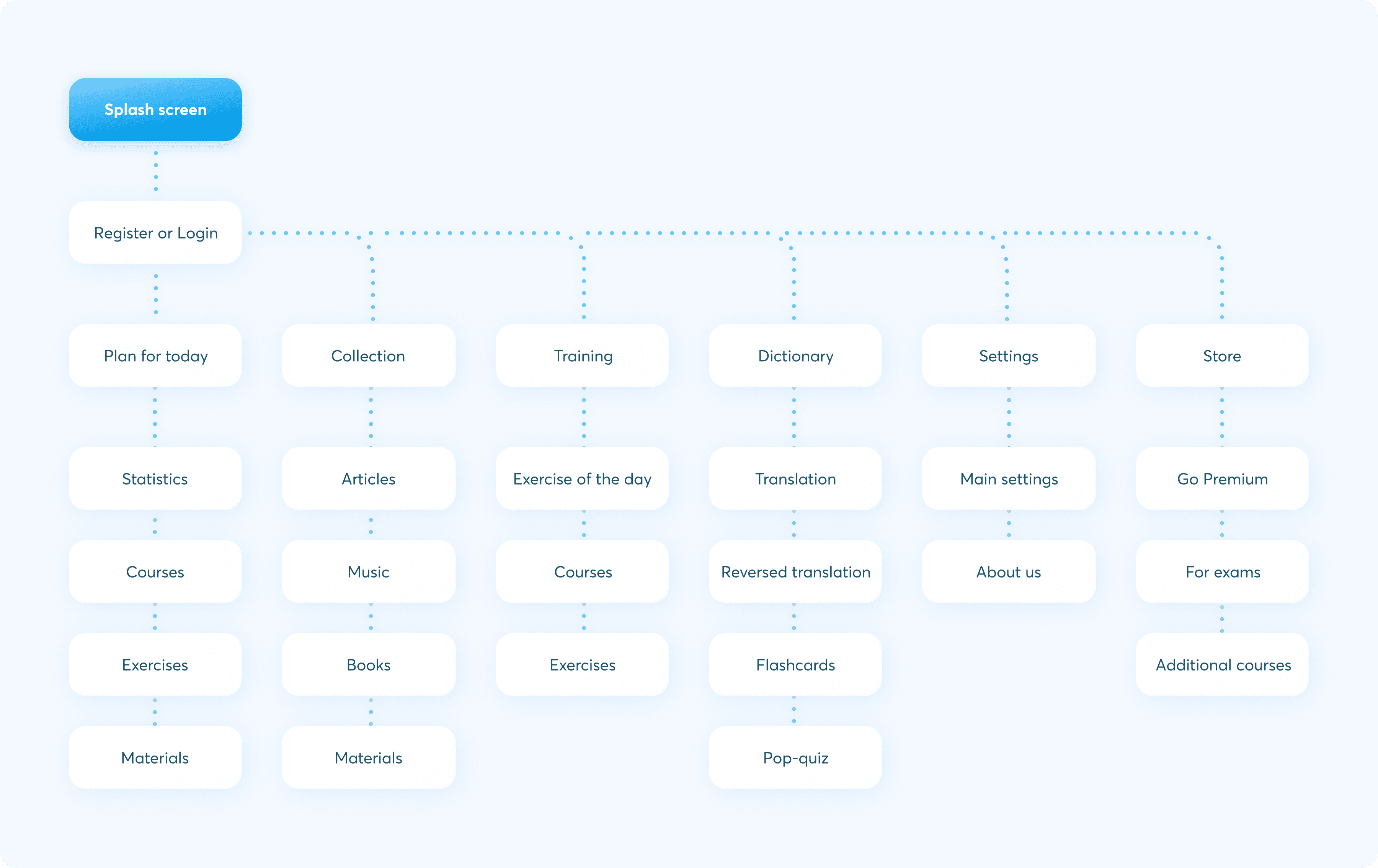
Art direction
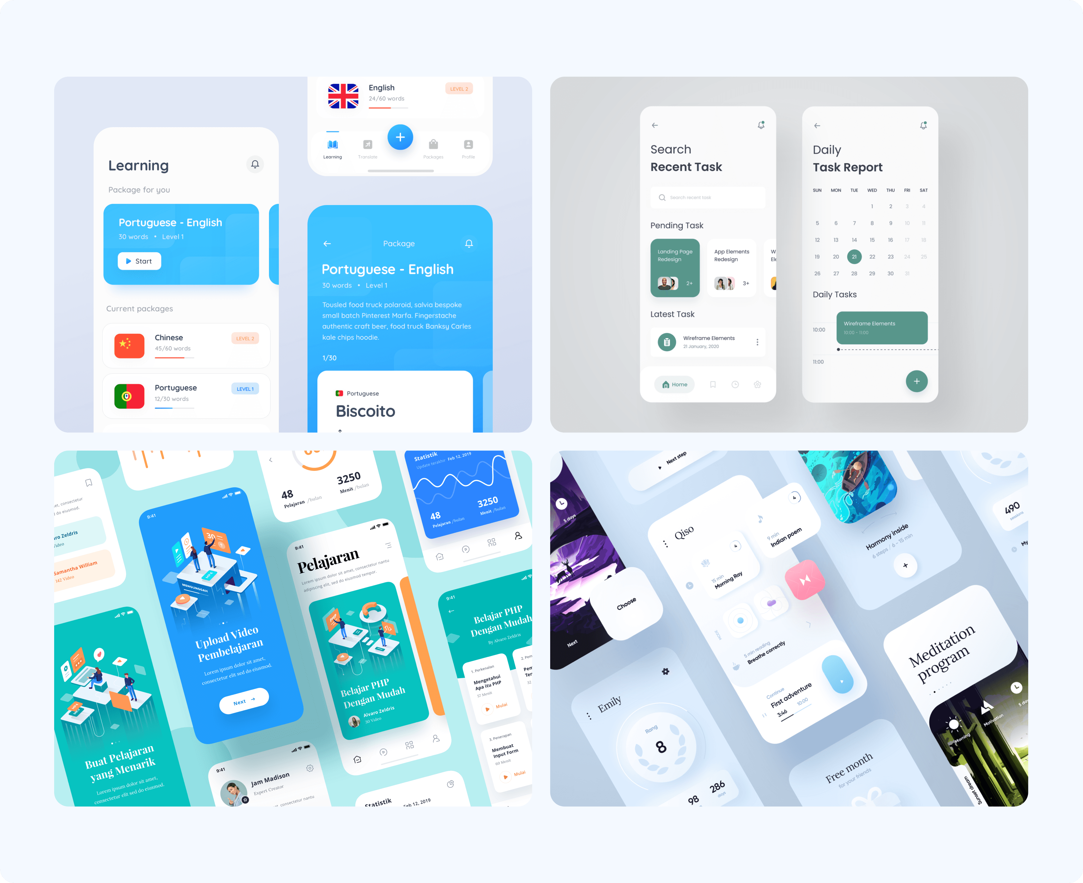
Before proceeding with prototyping, we established an art direction. To convey the key meanings, such as the ease of learning with Puzzle English and a friendly atmosphere that supports motivation and progress, we gathered visual references.
Then we collected relevant visual elements such as fonts, color, and graphics to reflect the meanings found.
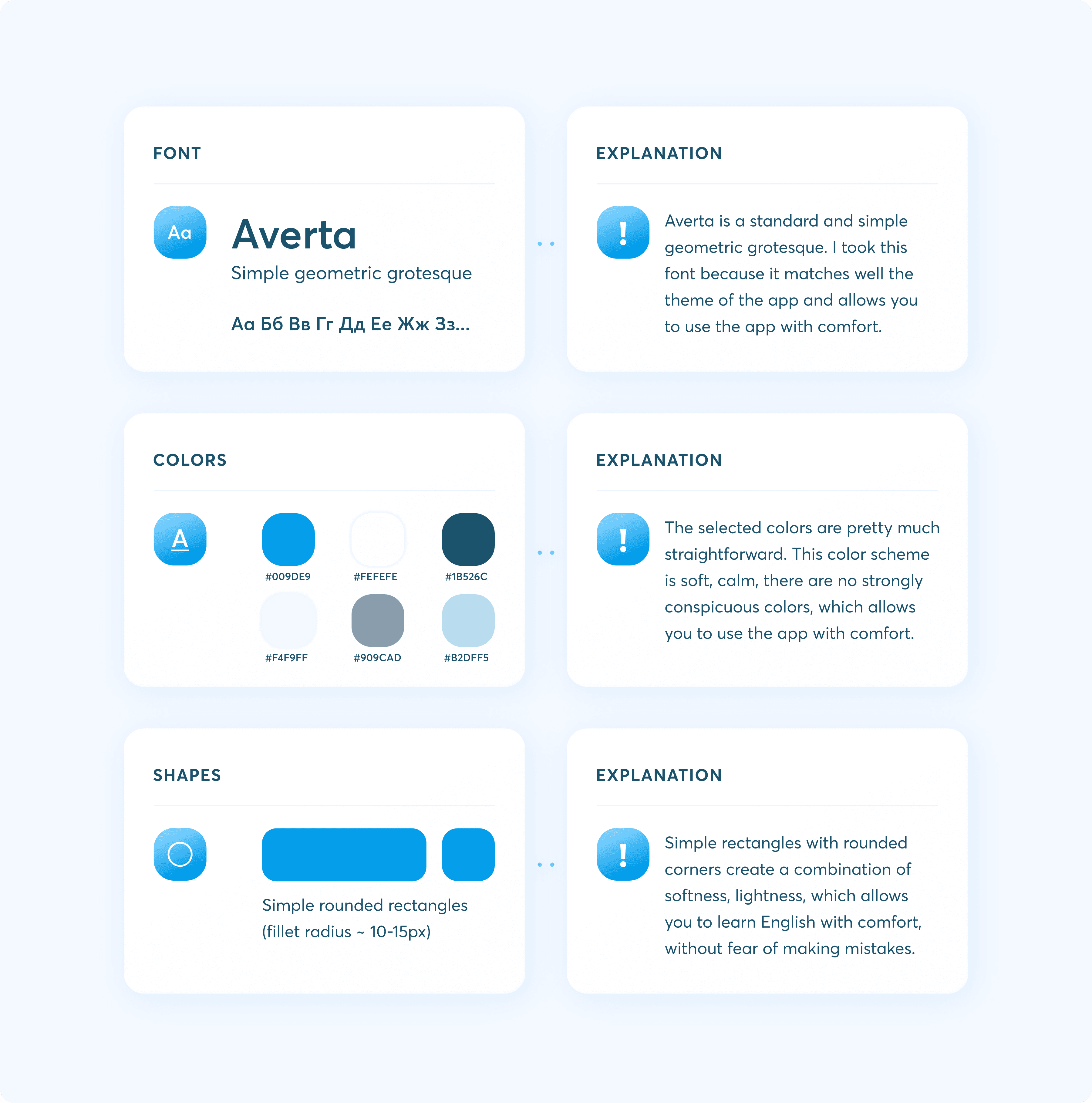
Design
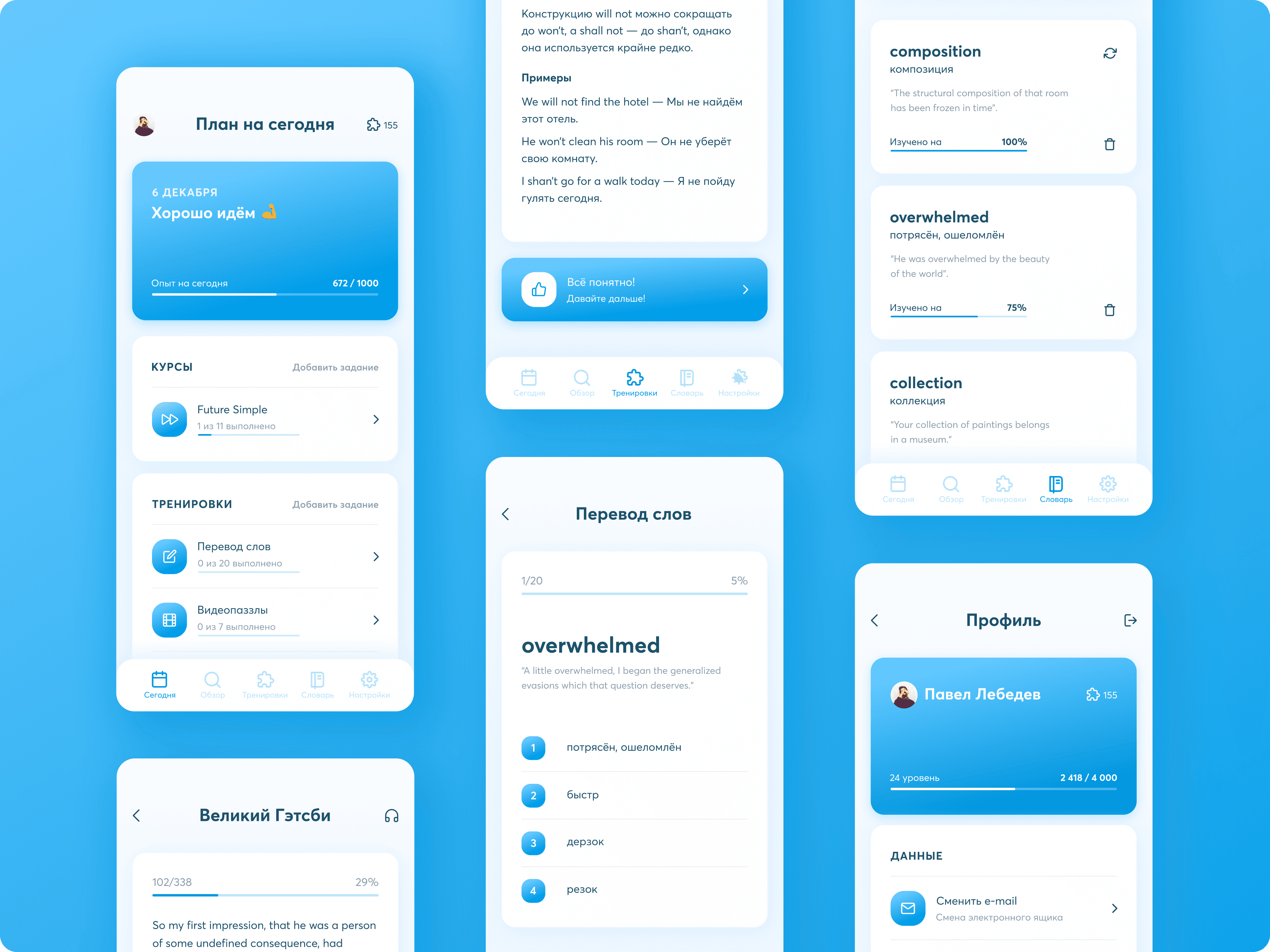
After defining the art direction, we began designing the UI screens directly. In total, we designed over 120 screens to encompass all user scenarios. We completed this task within a span of 2 weeks.
User Onboarding
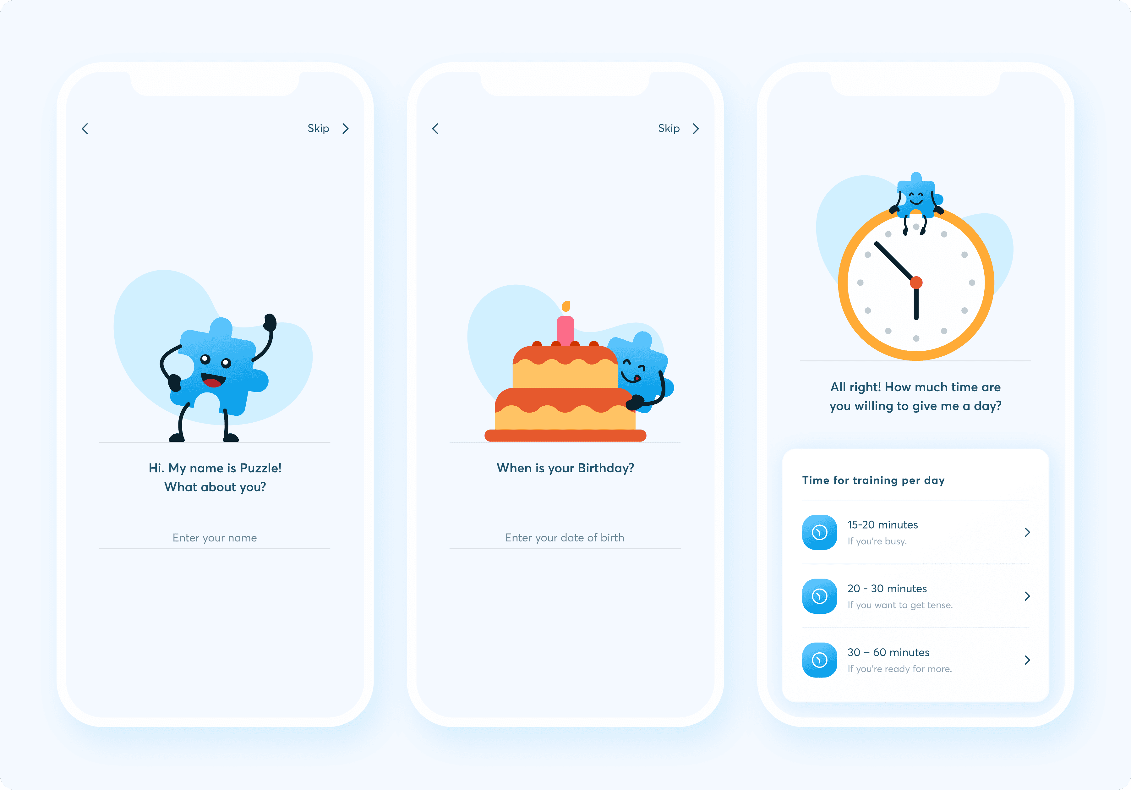
On the onboarding screens, the user is introduced to their helper named Puzzle. With Puzzle's assistance, the user can establish their goals and objectives. If the user does not wish to set their goals at that moment, they have the option to skip this step and return to it for completion later.
Courses
Grammar courses are divided into small sections, consisting of both theoretical and practical components. This division is implemented to facilitate learning and mastery of each topic. If you have a complete understanding of the current topic, you can click the "I understand" button. Should you decide to switch to a different screen, your course progress will not be reset.

Dictionary
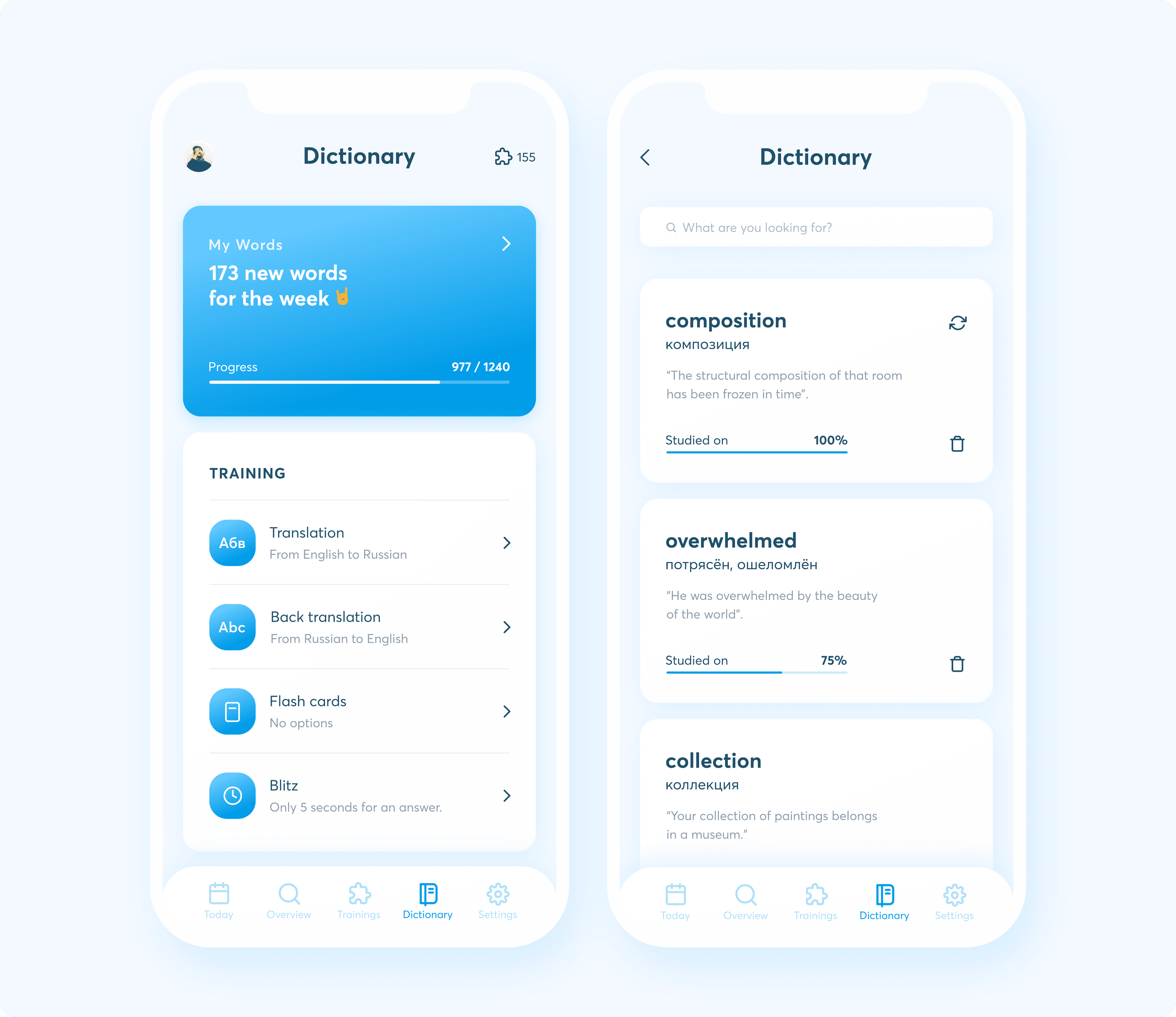
On the main screen of the section, a user can access the statistics for new words, as well as various training sessions, including flashcards, word translation, and reverse translation. In the "My words" section, a user have the option to delete a word from the dictionary or mark it for re-learning if its progress has reached 100%.
Exercises
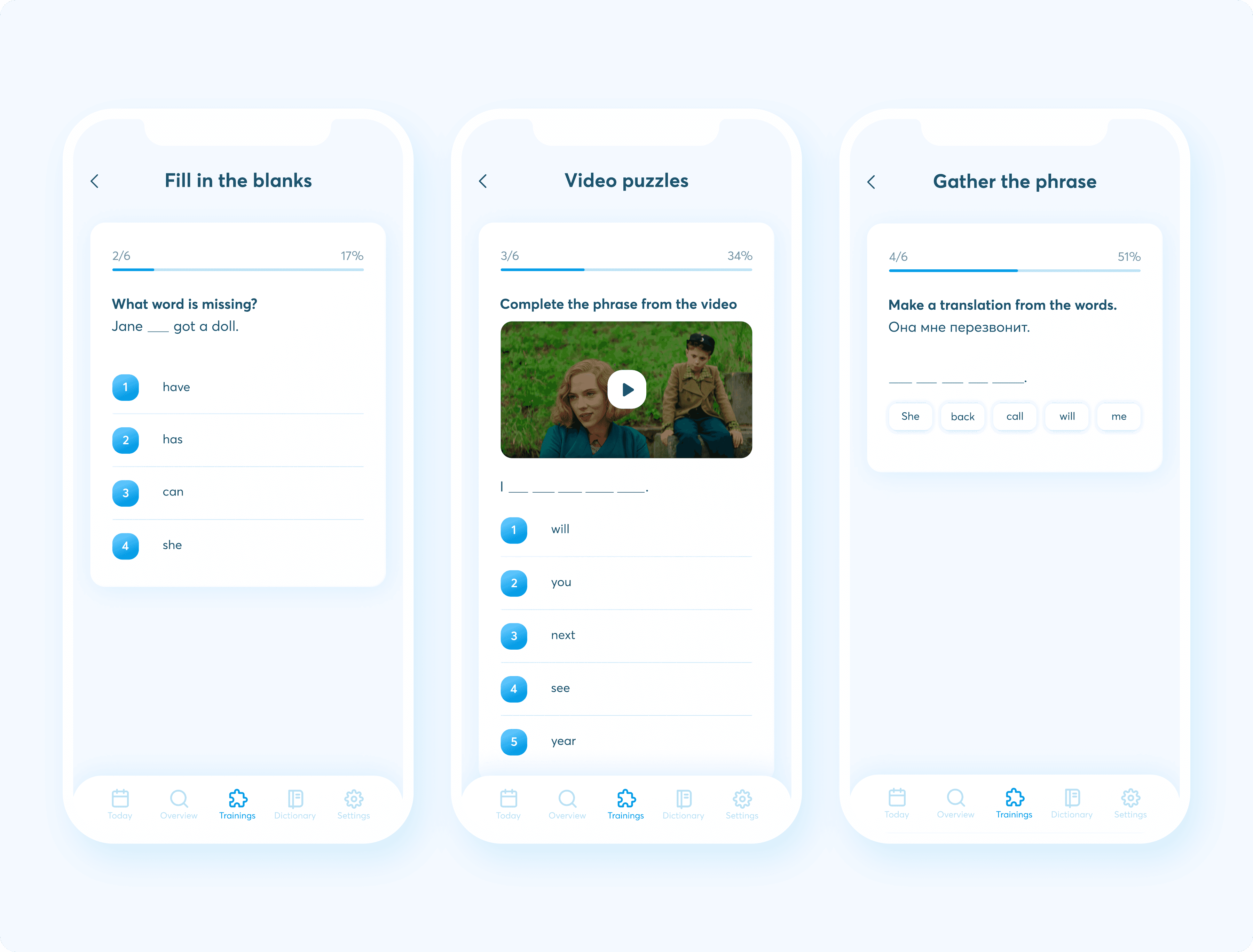
The in-app training sessions are designed to enhance your listening a user speech comprehension skills, ultimately increasing language proficiency. These sessions are structured in a supportive manner. If a user selects the wrong answer, they will be prompted to choose the correct one before proceeding to the next task. This approach ensures a thorough understanding and encourages accuracy during the training process.
Final results
We not only succeeded in maintaining the style of information presentation in the app but also incorporated new features and enhancements. Additionally, we made improvements to the design style of the application. Our goal is to enhance the quality of the app, increase its active user base, and empower business owners to better compete with other English learning apps.
Credentials
Art direction, UI/UX Supervision: Dmitry Chernov, UI/UX: Pavel Lebedev
