Case study
/
Inflow
The product was #1. The design was holding it back.
UX
UI
Design system
Webflow
Health-tech
·
SaaS
Inflow is the number one science-based app for people with ADHD. The product worked. The design around it didn't.
When I joined, the onboarding flow had UX gaps that were costing activations. The website had typography inconsistencies and composition problems across every page. Six separate deliverables. No shared visual framework connecting any of them.
I was brought in to fix all of it and document a system that would prevent it from fragmenting again.
About the client
Industry
Health-tech / Consumer SaaS
Stage
Growth
Location
UK
Product
#1 science-based ADHD app
Results
50+
Ad concepts created for A/B testing
6
Deliverables: onboarding, web, landing pages, ads, deck, design system
1st time
A shared design system across all of Inflow's touchpoints
Six touchpoints. One broken system holding all of them.
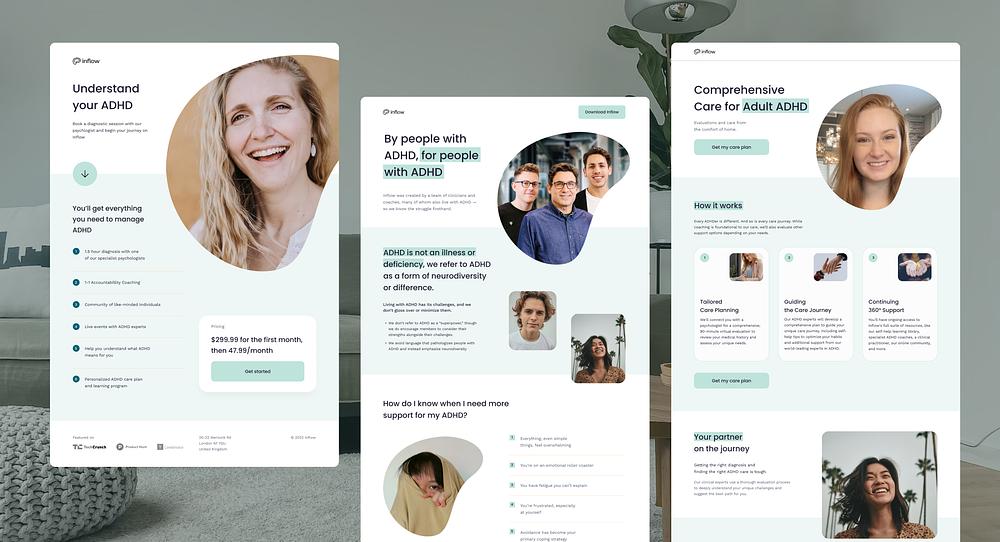
Inflow's core product had earned its ranking as the top science-based ADHD app. But every design touchpoint around it was falling behind. The website, the onboarding flow, the marketing assets: none of them matched what the product had become.
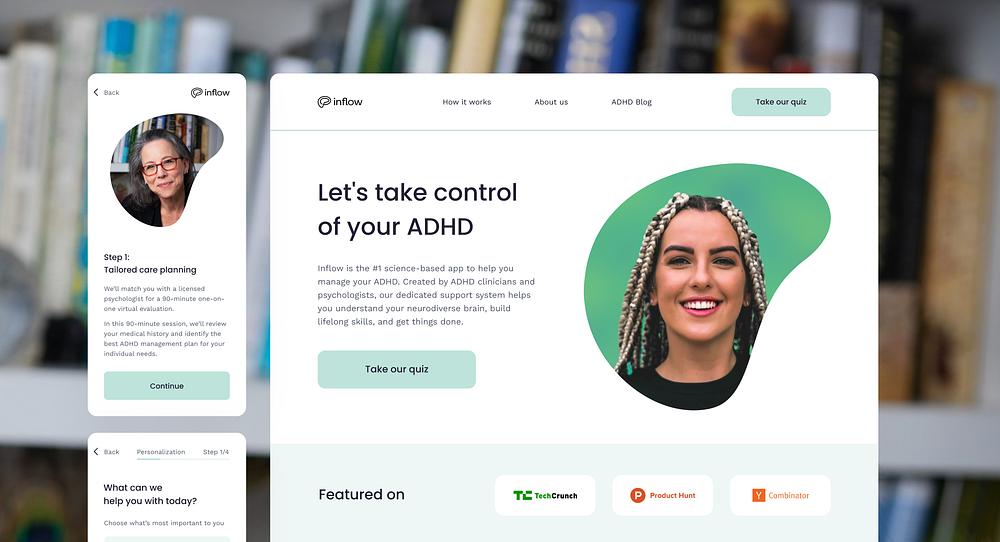
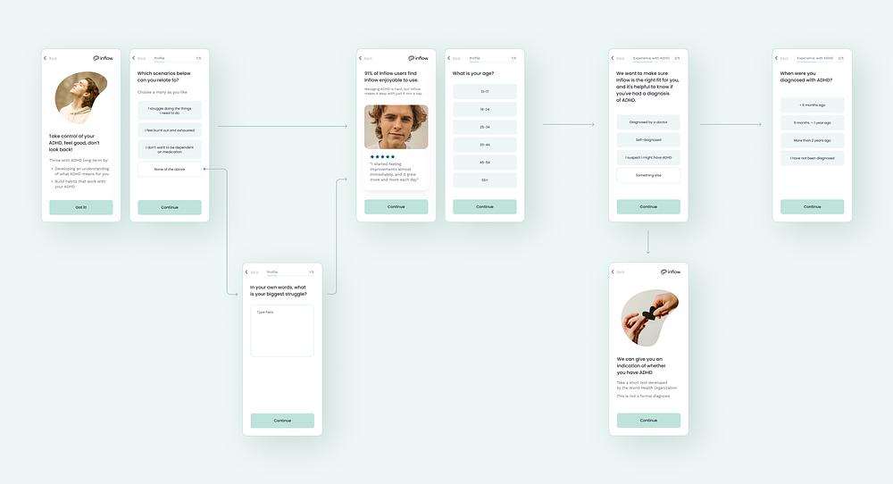
The onboarding quiz was the first real touchpoint for new users. It was functional, but it had the kind of UX friction that quietly kills activation: inconsistent components, unclear progress indicators, visual noise where calm was needed. Users with ADHD are particularly sensitive to cognitive load. A poorly sequenced onboarding doesn't just frustrate, it drives drop-off at the moment of highest intent.
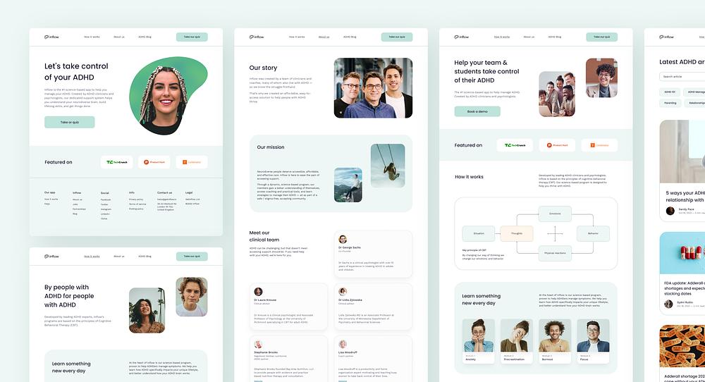
The website had the same issues at scale. Layout problems, typography inconsistencies, graphics that broke on mobile. The design system existed in fragments: partially defined, inconsistently applied. Marketing was producing landing pages and ad creative with no shared visual framework. Every asset was a one-off.
Old website home hero snapshot
Audit first. Then fix it. All six layers.
The onboarding quiz rebuilt from scratch. Cleaner component structure, clearer progress signals, and significantly less cognitive load for users who don't need one more reason to drop off during the most critical moment of activation.
Multiple landing pages designed in Figma and shipped via Unbounce. Each one built on the design system, not assembled from scratch. Consistent visual language across every campaign, every product.
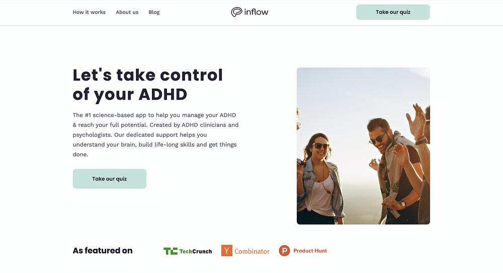
Layout, typography, color, and graphics fixed across every page. The design system expanded and properly applied for the first time. Rebuilt on Webflow with Client-first methodology: full responsive implementation.
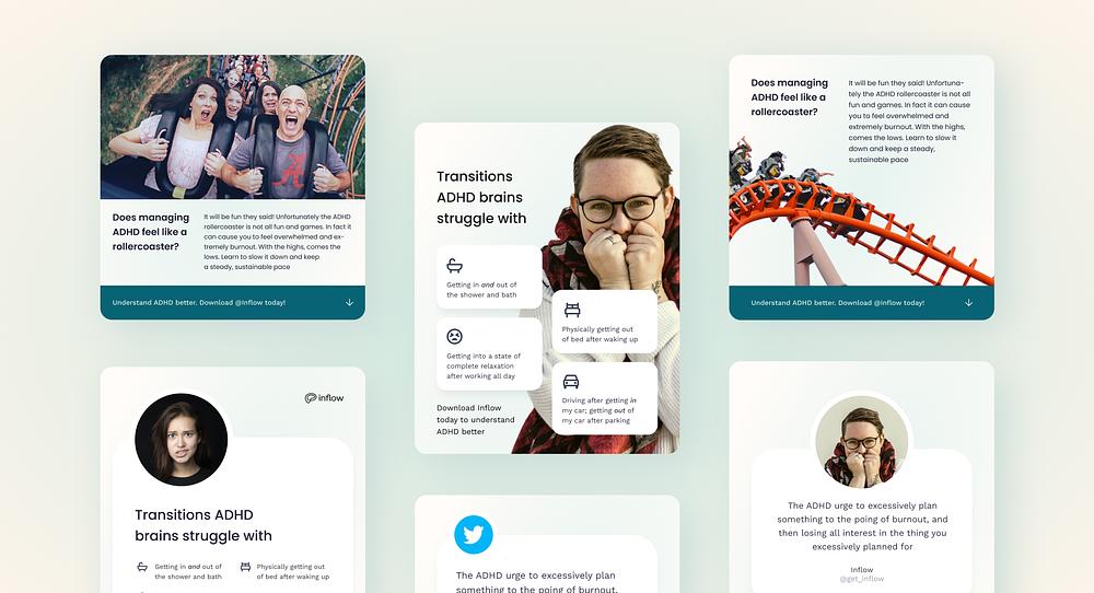
50+ ad concepts designed as a system, not a pile of one-offs. The marketing team got a visual framework they could test from, iterate on, and scale without starting over every time.
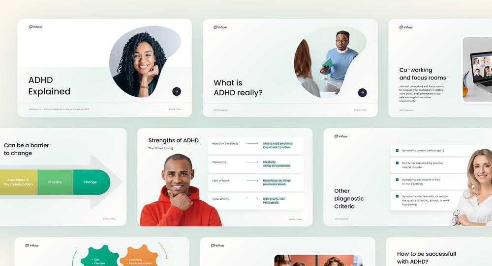
The onboarding webinar deck redesigned with refined content and a new visual style, aligned with the updated design system. One fewer asset living outside the system.
Systematic. Not scattered.
Six deliverables shipped. From onboarding to ads. A coherent design system holding all of it together for the first time.
Key achievements
01
Onboarding flow rebuilt: cleaner UX, consistent components, reduced cognitive load across the entire user journey
02
Website typography, layout, and graphics fixed across all pages. Rebuilt on Webflow with Client-first methodology
03
Multiple landing pages designed and shipped for different products and campaigns
04
50+ ad concepts created for A/B testing, giving the marketing team a system to scale from, not just assets
05
Webinar presentation redesigned and aligned with the updated visual identity
06
Design system established: typography, color, and components documented and applied across all touchpoints
50+
Ad concepts for A/B testing
6
Deliverables across onboarding, web, landing pages, ads, deck, system
1st time
Unified design system applied across all channels

"
We've worked with Dmitry as a web and graphic designer. He has fully satisfied our design needs in marketing. He helped us create landing pages, onboarding flows, pitch decks, and advertisements. He has also fully refined our website — fine-tuned typography and visual style, fixed composition problems, redesigned several pages from scratch and rebuilt our website on Webflow with a Client-First methodology. Dmitry is fast and responsive, and he creates a really clean design.
Let's talk about your website
Free 30-minute call. No commitment. I'll share 2–3 observations about your site before we discuss anything else.