← All writing
Website Audit
Conversion
You're fixing the wrong layer. That's why your site keeps losing buyers.
Most audits fix the wrong layer. Button colors, CTAs, mobile padding. The real problem is almost always in the first screen. It's not a design problem. Here's the diagnostic question that changes everything.
May 2026
/
5 min read
Overview
Someone lands on your site. They came from a Google search, a LinkedIn post, a referral from a colleague. They're not browsing. They're already 70% sold on the idea. They just need the site to confirm they're in the right place.
They read the hero. Then the next section. Then they scroll back up, re-read the headline, and close the tab. Maybe you saw it in the session recording. You still may not know why they left.
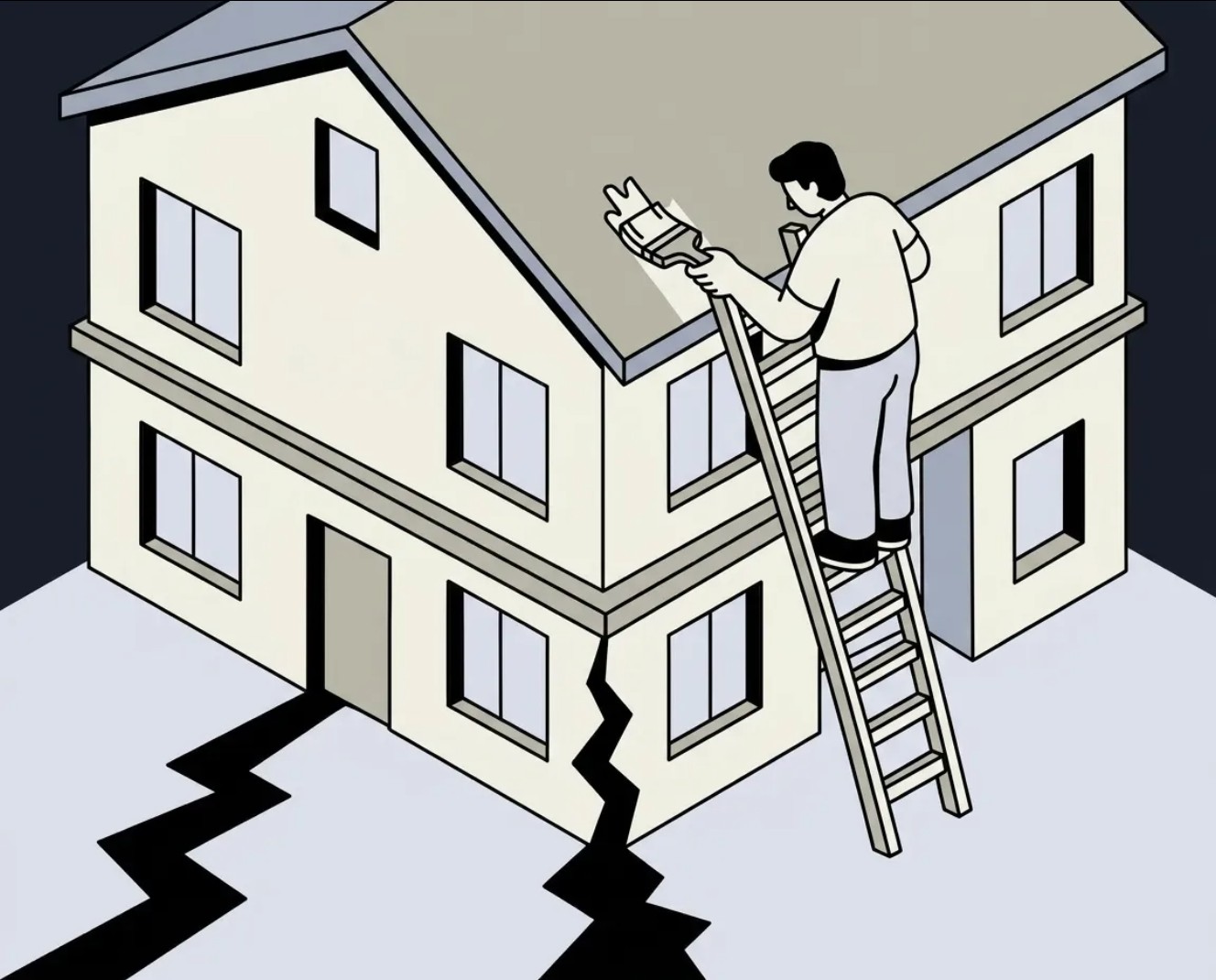
This is the problem most audits don't diagnose. They find the broken button, the missing mobile padding, the CTA that's below the fold. These things matter. But they're not why that person left. That's painting the trim. The foundation is cracked. That person left because the site failed to answer one question fast enough: is this for me, and if it is, what do I do next?
In 14 years of designing and auditing websites, I've seen the same pattern repeat: teams spend months on redesigns that don't move conversion. Not because the design was bad. Because they were fixing the wrong layer. You fix the color of the button when the problem is the headline. You rewrite the copy when the problem is the page structure. You launch a new design when the problem was a single sentence in the hero.
The question that runs every audit
Before I look at fonts, spacing, or component libraries, I ask one question: where is this site losing the person who was ready to buy? Not "what looks bad." Not "what would I do differently." Not even "what best practice is missing." Where is the decision to leave happening, and why? This single question changes the entire direction of the audit. It forces you to think like a visitor, not like a designer. And it almost always points to the same four places.
Four layers. One order.
I audit every site in the same sequence. Not because it's a checklist. Because the layers are connected. A problem in layer one makes everything in layers two, three, and four irrelevant.
Layer 1: Brand & Narrative. Can a first-time visitor answer three questions from the first screen alone: what is this, who is it for, why does it matter to me specifically? If the answer to any of those is "I'd have to read more to find out", that's where the money is leaking. Most sites fail at question two. They describe the product but not the person it's built for. Visitors don't self-identify, don't feel spoken to, and leave, convinced the product "wasn't for them." It was. The site just didn't say so.
Layer 2: UX — the path to action. Once the visitor understands what the product is, is the next step obvious, or are they left to figure it out? This is where navigation logic, page flow, and information hierarchy live. The question isn't "is the design clean?" It's "can someone who's never seen this product find what they're looking for without thinking?" If they have to think, they're already halfway out the door.
Layer 3: UI — where attention goes. Visual hierarchy exists to guide one thing: where the eye goes next. Every page has a reading sequence, intentional or accidental. Accidental reading sequences scatter attention: a five-column feature grid, three CTAs competing for the same space, a hero image that's more interesting than the headline. The UI layer is where I check whether the design is helping the narrative or fighting it.
Layer 4: Conversion — reasons to act now. Once you've answered who this is for, the path is clear, and the hierarchy guides attention correctly, one question remains: is there a reason to take action today, or just a reason to bookmark the page and come back later? Most conversion problems aren't CTA problems. They're trust problems. The visitor doesn't distrust you. They just don't have enough information to make a decision.
What this looks like in practice
A founder came to me this year with a specific request: they wanted 10 new sections added to their site in Framer. More content, more explanation, more reasons to sign up. My first question was simple: to what end?
I looked at the first screen. The hero headline rotated through three versions: "Built for Inspectors," "Built for Clients," "Built for Agents." Three audiences, one hero, none of them feeling spoken to. The inspector, the actual buyer, got their version 33% of the time. Below the headline: no problem statement, no explanation of what the product does or why it matters. The CTA read "Join our team of beta testers!" which sounds like a job application, not a sign-up.
Adding 10 more sections on top of this wouldn't fix anything. It would bury the problem deeper. We made three changes: fixed the headline to speak directly to inspectors, added a one-line problem statement, and changed the CTA to "Try Binsr Free." No new sections. The conversion problem was a narrative problem sitting in the first 200 pixels of the page.
The order matters because the layers are connected
You can't fix conversion if the narrative is broken. The most persuasive CTA in the world won't convince someone who doesn't know if the product is for them. You can't fix UX if the narrative sends visitors to the wrong mental model. They'll follow the path, but to the wrong destination. Audit in the wrong order and you'll spend three months on the wrong problem. That's not a design problem. That's a diagnostic problem.
Open your site right now.
Read the first screen. Just the first screen. Can a stranger answer: what is this, who is it for, why does it matter? Can they answer it without scrolling? If not, you don't have a design problem. You have a narrative problem. And that's where to start.
I do structured website audits: brand and narrative, UX, UI, and conversion, in that order. Every issue scored by severity, with specific recommendations for what to fix first.
Author
Dmitry Chernov
/
Web & Product Architect
.jpg)
.jpg)

Your website has problems you can't see. I'll find them for you.
Free 30-minute call. No commitment. I'll ask about your product and show you where the biggest friction is.
Your website has problems you can't see. I'll find them for you.
Free 30-minute call. No commitment. I'll ask about your product and show you where the biggest friction is.
Your website has problems you can't see. I'll find them for you.
Free 30-minute call. No commitment. I'll ask about your product and show you where the biggest friction is.
© 2026 Dmitry Chernov. All rights reserved.
© 2026 Dmitry Chernov. All rights reserved.
© 2026 Dmitry Chernov. All rights reserved.