← All writing

Conversion
Fintech
Revolut became a UK bank. You can't tell from the homepage.
A real banking licence with FSCS protection is the strongest trust signal in consumer fintech. On revolut.com it sits in the legal footer, not the hero.
Jun 2026
/
4 min read
By Dmitry Chernov / Web & Product Architect
The visitor you already lost
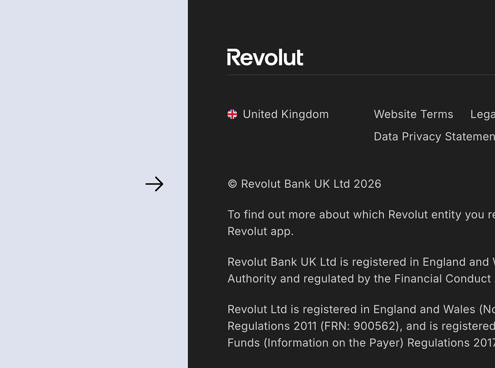
A UK visitor types "is Revolut a real bank" into Google and lands on revolut.com. The hero reads "Banking & Beyond. This is your bank, redefined." They scroll. More than 75 million customers worldwide, 13 million in the UK. A row of awards. 5% on savings. Cards, investing, a section called "Your money's safe space." Then they reach the bottom of the page, and the one fact they came for is still missing.
It is on the page. Once. In the legal footer, in fine print: "© Revolut Bank UK Ltd 2026," followed by a line confirming the company is authorised by the Prudential Regulation Authority. That is the answer to the visitor's question, filed in the part of the page built for regulators, not for buyers.
What changed in March, and where it went
On 11 March 2026 Revolut received its full UK banking licence from the PRA, closing a process that started in 2021. It moves the brand from e-money issuer to chartered bank. For a UK customer that change is not abstract. It means eligible deposits are now protected up to £120,000 under the Financial Services Compensation Scheme, the government-backed safety net that already covered Monzo and every high-street bank.
That single sentence is the most valuable thing Revolut can put in front of a cold visitor in 2026. It is the difference between "a slick app that holds my money" and "a bank that the state will make whole if it fails." On the homepage, it does not appear in the hero, the stat band, or the safety section. It appears in the footer.
There is a dedicated page for the milestone, just not where a buyer would meet it. It lives in the newsroom at /news/, dated 11 March 2026, and it carries the FSCS line and two CEO quotes. It is written for journalists, with a Notes to editors block and a press-kit download, not for the customer deciding whether to move their salary across. It is not linked from the homepage, so the only visitor who lands on it is the one who already knew to look.
Why the footer is the wrong place
Every product has one question the buyer needs answered before they commit. In consumer fintech it is "is this a real bank, and will I get my money back." Revolut just earned a definitive yes and stored it where nobody reads. A visitor comparing Revolut against Monzo, chartered since 2017, gets no on-page reason to close that gap, even though it has now closed in reality.
The cost is not aesthetic. It is cold visitors converting lower than they would with deposit protection in plain sight, and comparison-stage visitors leaving the site to find the answer on a third-party blog. The brand spent 5 years and a regulatory marathon to remove its biggest trust barrier, then left the result off the surface where the decision gets made.
What it looks like when the proof is on the surface
The fix is placement, not invention. The asset already exists. A trust band near the top of the page carrying "FSCS-protected up to £120,000." A tile inside the existing "75 million customers" block, sitting next to the award badges, that reads "Deposits protected by the FSCS." A dated milestone line, "March 2026: fully licensed UK bank," that doubles as a track-record signal.
Whether that exact wording fits where Revolut is taking the brand is something only their team would know. The principle underneath it does not change. The strongest proof a company owns belongs where the visitor decides, not in the legal copy they scroll past.
The pattern, not just Revolut
Across the fintech, SaaS, and Web3 sites I have audited, this move repeats. The best trust asset a company owns gets handled like a compliance detail instead of a conversion lever. A banking licence ends up in the footer. A SOC 2 report sits behind a sales call. A marquee customer hides in a logo carousel. A funding round nobody puts on the first screen. Revolut is the cleanest example because the asset is unusually strong and the placement unusually quiet.
The most expensive trust signal you own is the one you earned and then filed away. Revolut paid for its licence in years, not money, which makes the placement decision matter more, not less. The work that earns the proof and the work that surfaces the proof are two different jobs, and the second one is the cheaper of the two.
If you want a second opinion on where your strongest proof actually sits, I cover trust signals and homepage hierarchy in website audits.
Key takeaway
A trust signal buried in the footer earns nothing until you move it to the first screen the buyer actually reads.
SOURCES
WHEN THIS DOESN'T APPLY
This applies when the milestone changes the visitor's risk, like deposit protection. A licensing or backend change with no customer-facing consequence does not need homepage space.
By Dmitry Chernov /
Web & Product Architect
Web & Product Architect
I run fixed-scope website audits across 4 pillars (brand, UX, UI, conversion) for founders building AI/ML startups, B2B SaaS, Dev Tools, and Web3 products. 14 years in design. 170+ shipped, 20+ in Web3.
Available
/
UTC+4
/
03:14
Keep reading
Audit notes
Conversion
Healthcare
12 of 13 healthcare-AI sites are silent about AI hallucinations
Jul 2026
/
4 min read

Audit notes
Conversion
Web3
Your root domain is your front door. Don't aim it at your app.
Jun 2026
/
5 min read
.png)
UX Patterns
Web3
Trust Signals
Let buyers verify your proofs. Don't just show logos.
Jun 2026
/
7 min read
Start with a 30-minute call.
Free intro call, no commitment. You'll leave with 2 – 3 specific observations about what's costing you conversion before we discuss the audit.
Dmitry Chernov
Web & Product Architect
AI, SaaS & Web3
© 2026 Dmitry Chernov. All rights reserved.